One of the greatest gifts I’ve been given is the opportunity to write and illustrate children’s books. My first picture book, Twirl, was my longtime dream come true project. Build followed with a dear-to-my-heart message made especially with boys in mind. And now I get to introduce you to a brand new children’s book, coming March 2025.
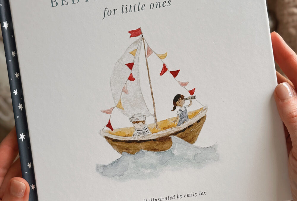
Meet Bedtime Blessings for Little Ones, a heartwarming picture book filled with delightful illustrations and sweet words of spiritual truth to fill young hearts and minds as they are tucked in to sleep.
I can not wait to tell you so much more about this sweet book – the story behind the story, the process of illustrating and watching it all come together. But for today, let’s talk about the cover!
the cover
I’m one of those who chooses a book by its cover (you too?!) and it felt especially important for this book to have a darling cover. From the start of this project, I imagined this book facing out on a book ledge in nurseries or set out on nightstands next to cozy rockers to make reading a page each night easy. It’s for boys and girls so the cover needed to feel gender-neutral and classic as I hope this sweet book of blessings will pass down for years to come.
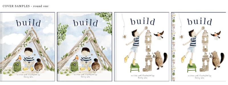
After submitting the manuscript and finished illustrations, my publisher came up with a handful of initial cover ideas. Their main objective was to clearly communicate the bedtime aspect of the book so they gravitated towards comps that had owls, stars and dark backgrounds.
Here is the first round of cover concepts from my publisher’s design team:
It is so fun to get these in my email and see what other designers come up with using my art!
None of these felt quite right, so I asked if I could come up with a few ideas just to give a clearer direction. Here are my cover samples:
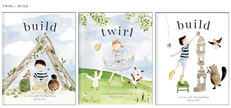
I’m drawn to lots of white and very classic fonts. It was good for me to come up with a few ideas just to clarify what my aesthetic was for the book. I’m so grateful that my publisher really wants me to love the cover and is willing to make lots of changes to get it just right! After seeing my ideas, the designer came back with another round of options:
These new samples felt instantly right. I loved the added star border and it was just a matter of deciding which illustration was the best for the front. I asked a handful of friends and we all landed on the cute little sailboat explorers!
Once the main layout was decided on, we played with font selection and I feel so happy with how it turned out. It’s classic and simple and I hope it will look equally darling in a baby girl or baby boy’s nursery.
I’ll have much more to share about this sweet book that I am excited to do in the next few months before it officially releases March 4, 2025!
For as long as I can remember, I have loved the illustrations in picture books. I remember staring at all the little details, looking at each page for much longer than needed, and yet absolutely captivated. What an honor it is to get to create illustrations that children will enjoy, notice details, make up stories about, choose favorites, trace, be inspired by … I’m truly so grateful I get to do this work!
So let’s get into it! Here’s a peek at how the illustrations for Build came to be.
the illustration process
Because Build is the sibling book to Twirl and their formats are so similar, it made the process very easy! The layout is nearly identical to Twirl so I was able to follow along with the same template I made the first time around, with just a few minor changes to fit this story best.
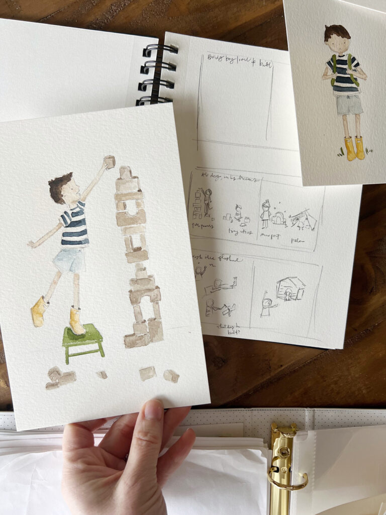
One of the best parts about being the author and illustrator is that while writing the story, I had pictures swirling in my mind. In my sketchbook, I drew very rough sketches of each page just to get my ideas down on paper. When it came time to actually translating what was in my mind to paper, I started by creating a page layout in Adobe Illustrator, adding the words and leaving the rest blank where the illustrations would go.
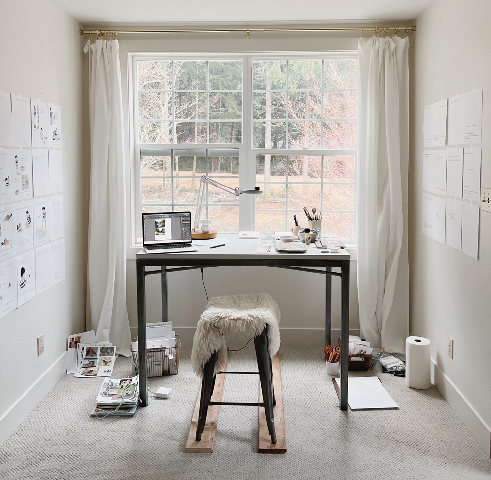
At my watercolor desk, I taped up all the blank pages to the wall. When a new series of illustrations was complete, I scanned them, edited them slightly, and added them to my Illustrator book document to print out. As more of the story came to life it was so nice to have it all up on the walls around me to help me watch progress, make sure the colors and characters looked consistent, and see how much was left to finish!
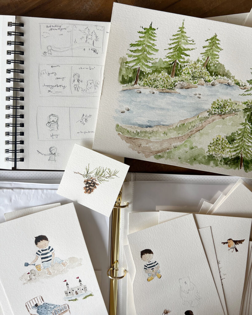
All of my artwork is done with paper, pencil, and watercolor paint. Once the illustration is finished, I scan each painting at a very high dpi to ensure the quality will remain crisp when printed. Next, I open the image in Photoshop to remove the background and make any minor edits (erasing extra markings, isolating objects, maybe shifting an eye over a tiny bit to make the character look happier). One thing you’ll notice in the pictures is the imperfection of hand-drawn art – little pencil marks, the paint bleeding and pooling, etc. With much of the artwork on children’s books moving to being digitally created, I feel really happy with the hand-made nature of the illustrations in this book. I hope there is a classic, nostalgic, and approachable feel to each page.
My style of art is so airy with lots of white space so you’ll notice that most of the artwork in the book are ‘spot’ illustrations – without a background scene. The one full-page spread with a background sets the scene for where this adventure takes place and I hope it stands out among all of the whitespace in the other illustrations! It was fun to create that scene and makes me want to venture more into landscape painting.
illustrating the characters
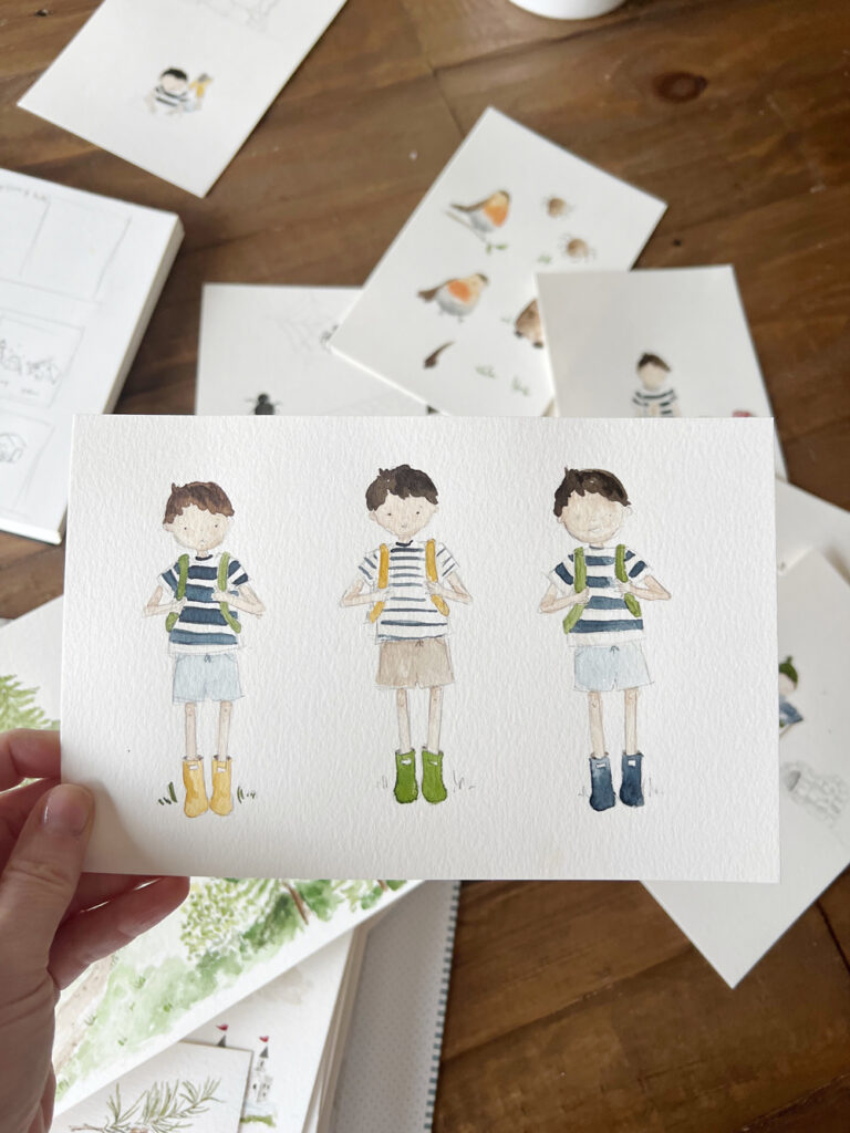
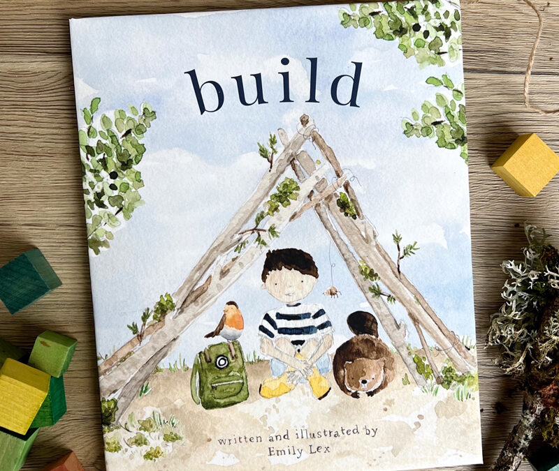
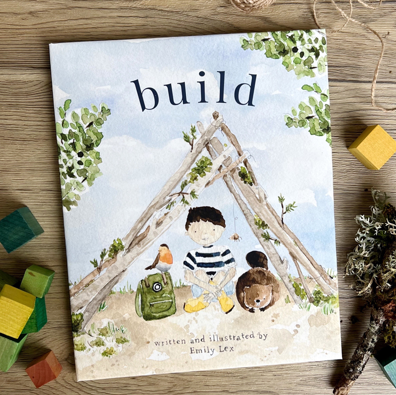
Even though our main character’s name is Brady boy (named after our second son), Build is wholly inspired by my husband and all three boys and you’ll find little nods to each of them throughout the book, both in words and pictures. It felt right to give him Ryan’s hair and skin coloring, and I dressed him in things my boys wore when they were little – a striped t-shirt (that coordinates so adorably with Audrey girl’s dress in Twirl!), easy shorts, yellow rain boots. Even his little backpack is inspired by my oldest son’s!
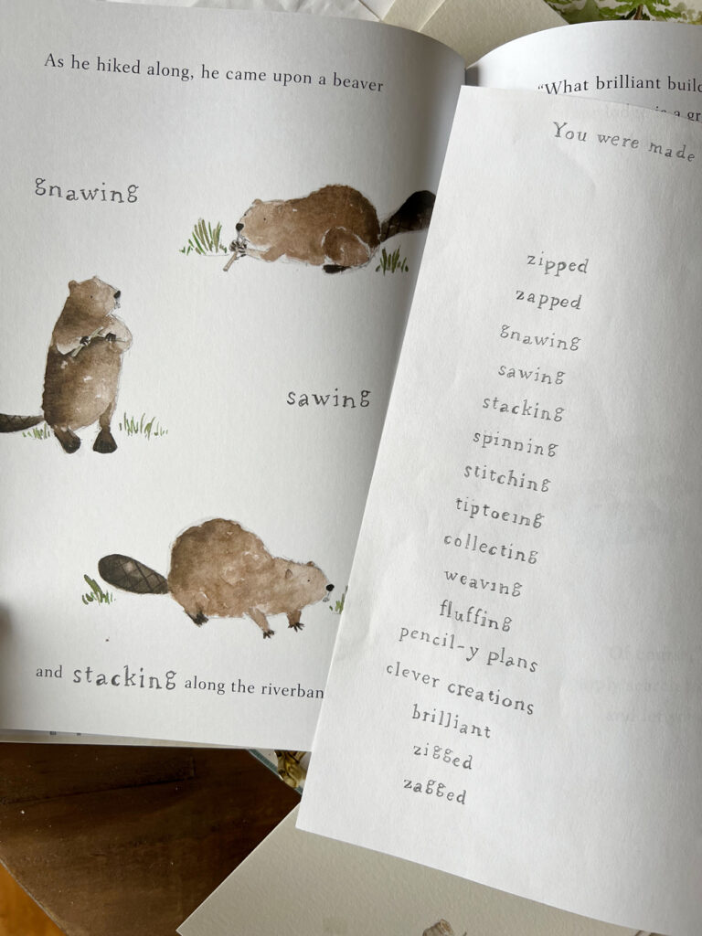
The animal friends were fun to dream up. I used a ton of reference photos to figure out what each animal looks like and how they move so I could try to make them look natural.
Itsy Bitsy Spider took the longest to get just right (even though she is so simple!). How do you make a spider look cute and not creepy?! Wide-set tiny dots for eyes, pink cheeks, striped legs, and a friendly brown color seemed to do the trick. Her spider web was drawn with pencil and I love the detail of her web in the pictures.
One of the trickiest parts about illustrating characters is keeping them consistent from page to page and from all different angles. One of the little tricks I learned is that keeping the clothes and accessories the same throughout the story helps a child identify the character and the imperfections in proportion, eye placement, etc. are much less noticeable!
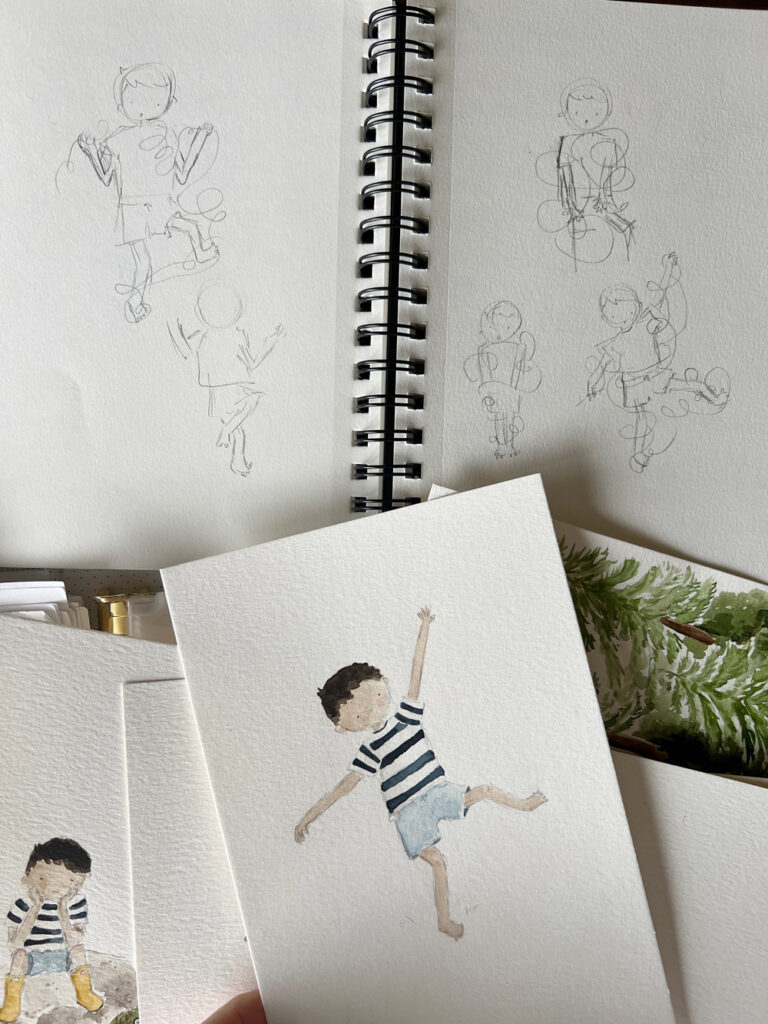
When it came to movement, once again, I followed the same strategy as with illustrating twirl and used reference photos. What does a little boy look like sitting crosslegged building legos? What about sneezing? Or tangled up in string? Sometimes I moved my own body into a pose to figure out what a body does and that was helpful too 🙂
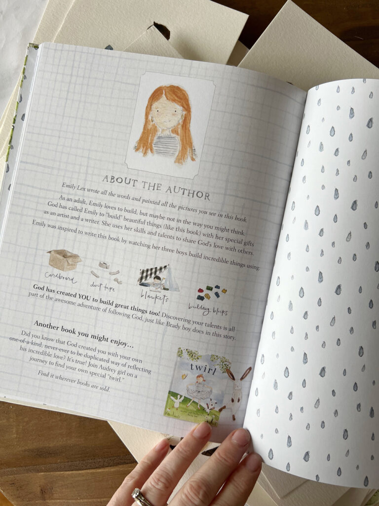
all the extras
You know how much I love paying attention to little details and this book is no different. You’ll find cute end sheets (I love cute end sheets!), a sweet bible verse, a dedication, and an about-the-author page. My publishing team was so creative with the suggestion for the about the author page and I hope it brings one last smile before you close the book. These special pages were so fun to create!
Just like with Twirl, I was able to incorporate hand lettering into the pages of Build. The sketchy pencil, rubber-stamp-inspired letters make this book feel even more playful, personal, and full of imperfect charm.
Writing and illustrating Build was a dream come true for me and such an incredible experience. I hope this was a fun peek into the illustrating process. If you have any questions, please leave a comment and I’d love to answer!
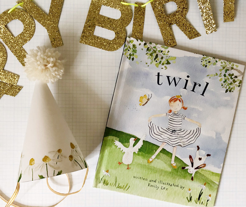
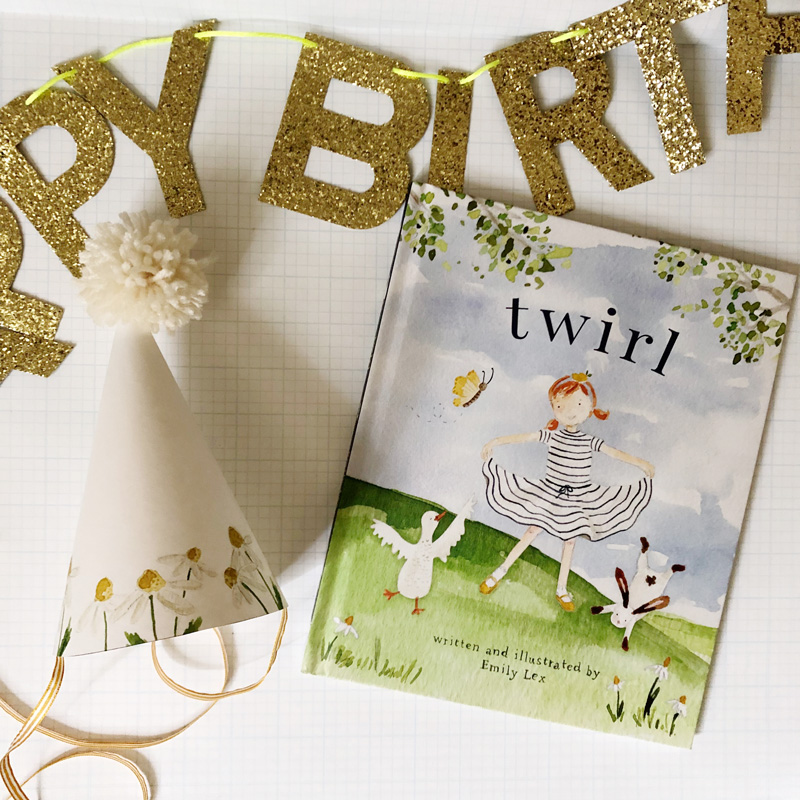
One of the greatest gifts I’ve ever been given is the opportunity to write and illustrate children’s books. My first picture book, Twirl, was my longtime dream come true project. It was a message I had in my heart for such a long time and an absolute delight to write a story and paint pictures that help little girls remember that they are perfectly and wonderfully made.
Before I even turned in the first manuscript for Twirl, I wrote a very rough draft for a similar book, especially with boys in mind. The story came quickly but sat untouched on my computer as a rough file, just living as a quiet little dream.
After the great reception of Twirl and lots of questions like where’s the boy version?! I was so excited when my publisher said yes to me writing and illustrating that little dream of a book for boys. With lots of collaboration with Ryan (he came up with the title!), my three teenage sons, my five-year-old nephew, and my incredible editor, I’m so happy to tell you that it’s done! It’s coming soon! And I can’t wait to show you a peek.
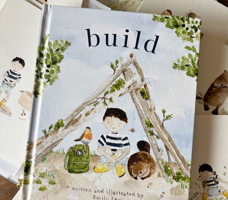
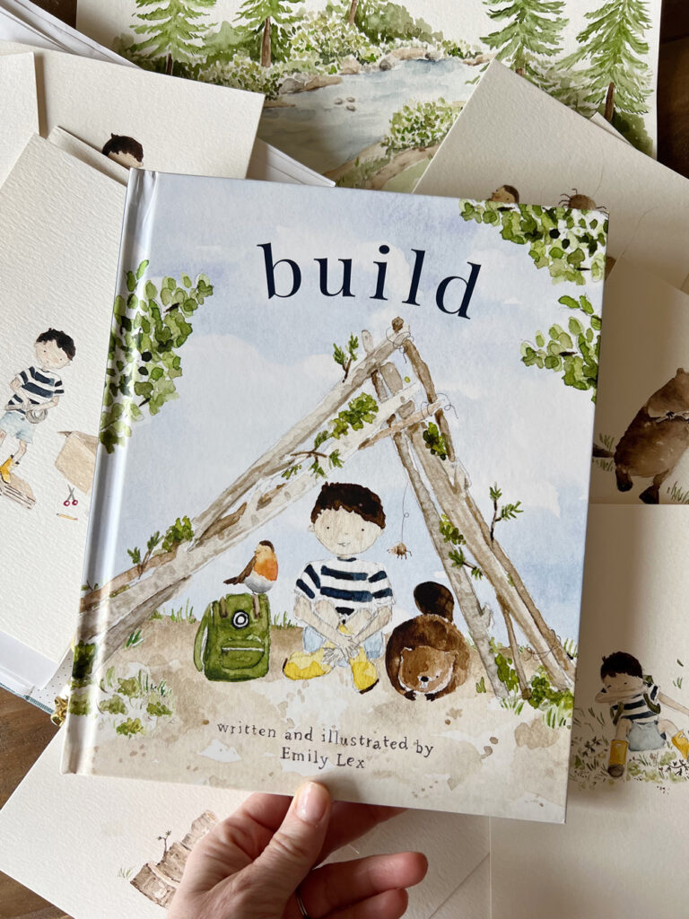
Introducing, Build, a happy story with adorable characters, charming illustrations, and a message that all little (and big!) boys need to hear: God created you to make and do amazing things!
\
There is much to share about this sweet book – the story behind the story, the process of illustrating, and watching it all come together. But for today, let’s talk about the cover!
the cover
I’m one of those who definitely chooses a book by its cover (you too?!) and it feels especially important for a children’s picture book.
The designer from my publishing company came up with a few initial cover comps. Would you like to see them?
One thing we wanted with Build was for it to look good next to Twirl. I love that they are sibling books and we wondered if we liked the idea of them being super similar in design or just compatible? It was fun to see variations of two different options.
Here’s a side-by-side just so you can see:
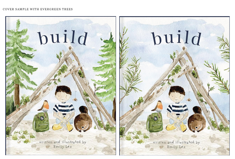
After looking them over, comparing the different versions, and showing my family and some friends, we all decided we were leaning toward the cover that felt more similar to Twirl. One thing, though, that I wanted to see was how it would look with trees that were a little more northwest-y. So the designer gave me two samples:
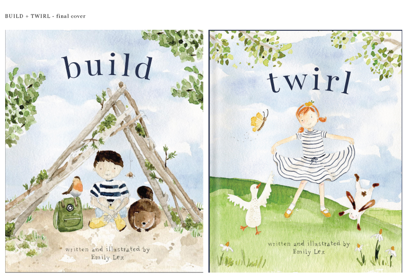
Both were cute, but I actually liked the fluffy branches better. So we went back to the other branches and made a bunch of tiny little changes (my publisher is SO gracious to me to let me request so many tweaks!) and after a few more versions we made it to the final, final, final cover!
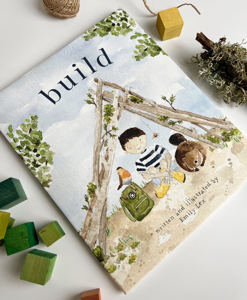
Isn’t it cute?!
I love that the fort is a little asymmetrical on the page. I love that Mama Bird is perching on the backpack. I love the tiny ant walking up the log. I love the navy stripes that are repeated (but a little different) on the two main characters in the books.
I’ll have much more to share about Build in the upcoming weeks as well as special gifts and surprises that you won’t want to miss.
Thank you so much for your excitement about this project. I truly can not wait for you to hold this book in your hands, read it to the little boys (and girls!) in your life, and share it with friends.
I suppose it’s been the question since the beginning of time.
I imagine the moment when Jesus goes before the Roman governor telling him the reason he was born and came into the world was to “testify to the truth” (John 18:37). Pilate responds with a puff of arrogance and disillusionment. “What is truth?” he retorts.
I get it. It’s frustrating and confusing to be told so many mixed messages. To have truth defined and redefined, subjective to the point where we doubt that there is even such a thing as Truth.
If I think long and hard about it, I wonder if the questioning of truth is actually more about trust than it is truth (do I trust someone else to tell me what is true or do I get to be the one in charge and decide what is true on my own?)
Defining, demonstrating and declaring truth is what Jesus came to do. It’s who he is; the very nature of his being is Truth.
But it’s super hard to adopt his truth – to believe that it is truly TRUE and let it inform how we think and live – if we don’t first trust him. Is he good? Is he for us? Are his ways really worth following?
This trust might happen in an instant … but more likely, it is what develops incrementally through daily choices, through community, and Truth-filled reminders.
We are a people who are prone to wander.
And he remains.
Let us fix our eyes on him. Let us fill our minds and hearts with the things that cause us to trust in him. And as we do, “may the God of hope fill us with all joy and peace” so that we will “overflow with hope” (Romans 15:13) to a questioning world that always has and always will be longing for Truth.
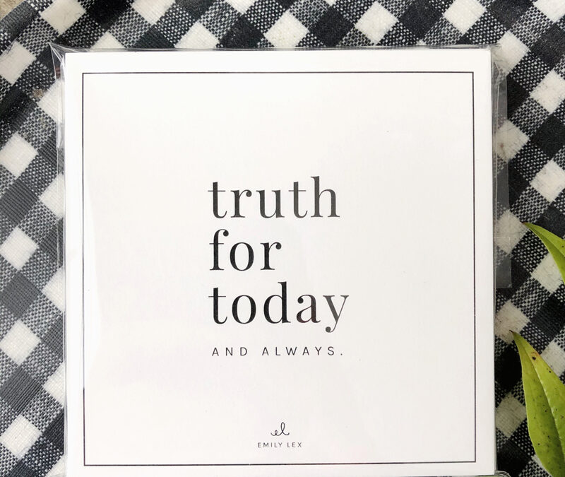
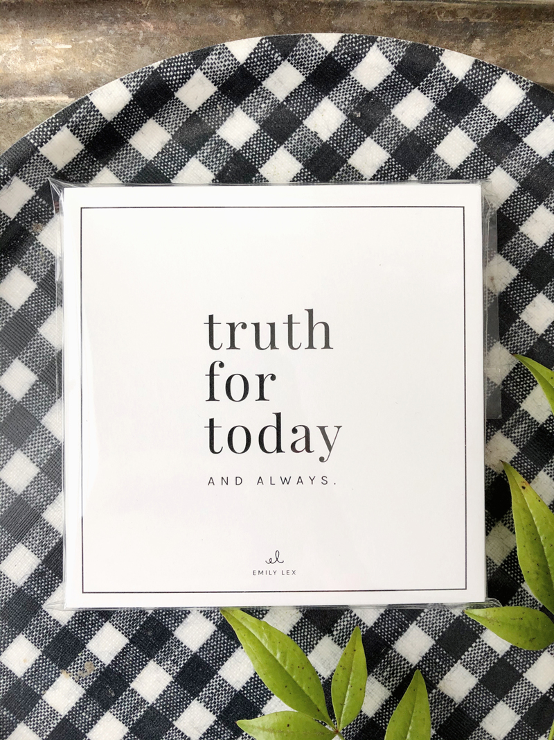
Order a set of Truth For Today cards for daily reminders of God’s goodness and faithfulness.
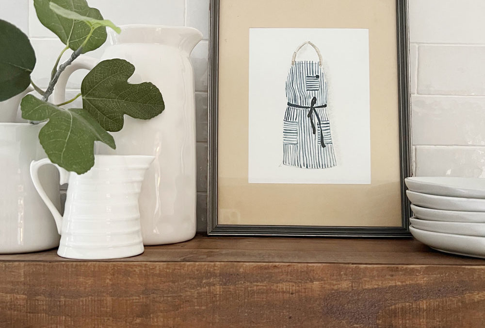
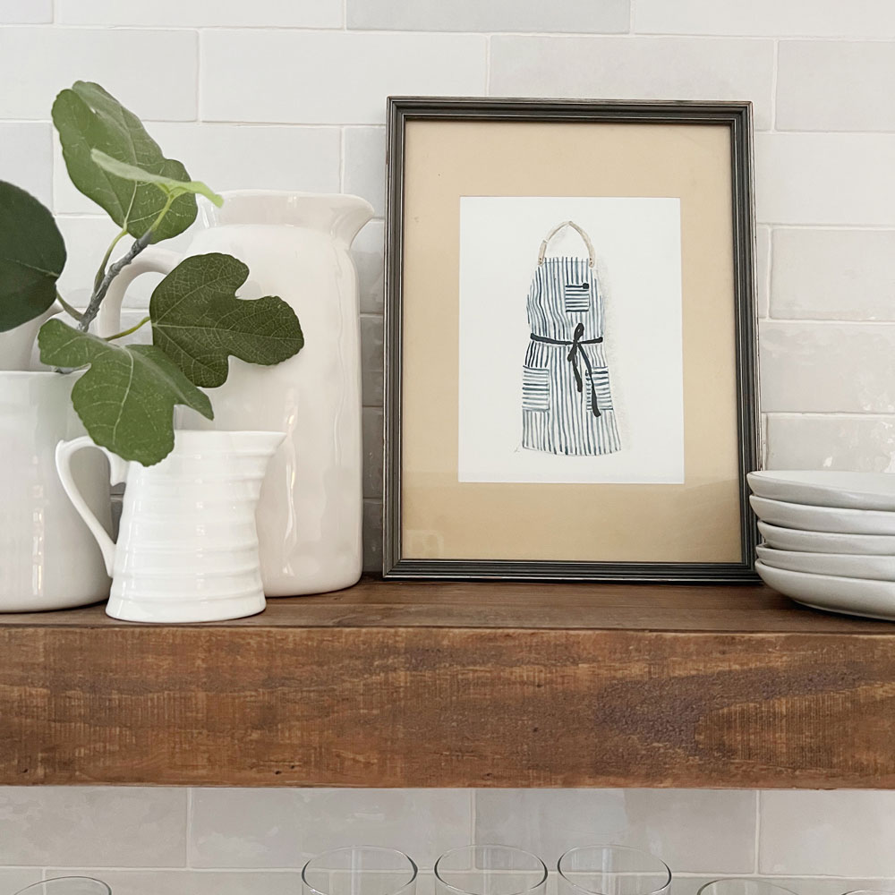
An art print is a lovely way to add personality to any space. Choose your favorite painting from my collection of prints, pop it in a frame and display it around your home!
Art prints are available in 8×10 and I think they look particularly great when framed with a mat. Choose a frame size that is larger than 8×10 to make your art look substantial and really pop on your walls.
Here are some of my go-to suggestions for picture frames:
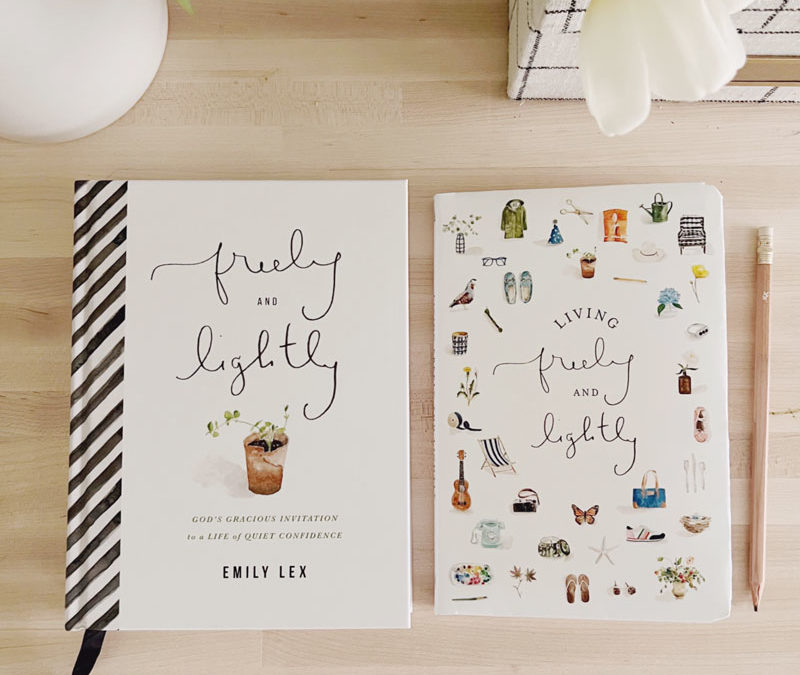
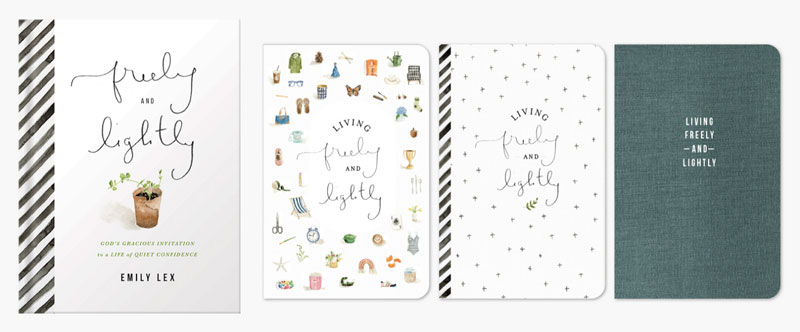
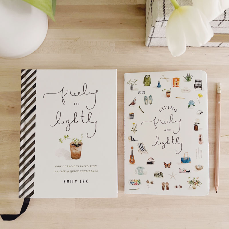
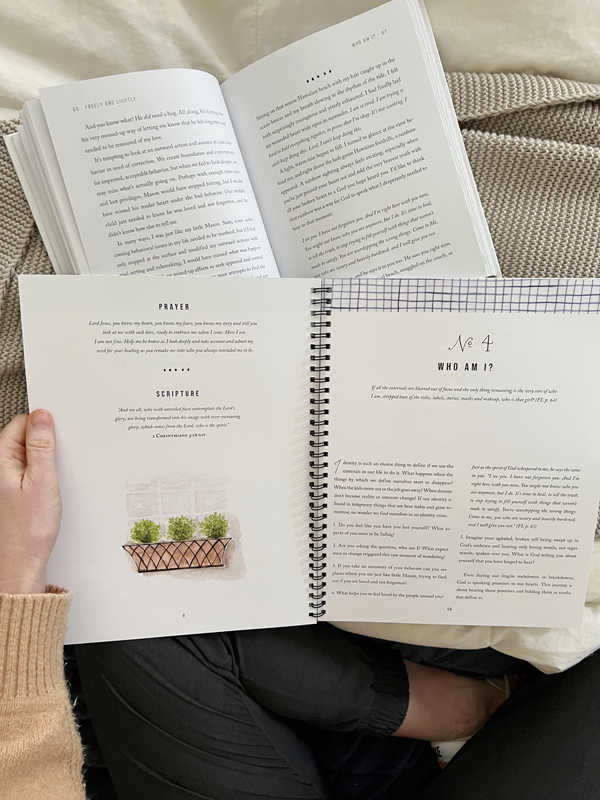
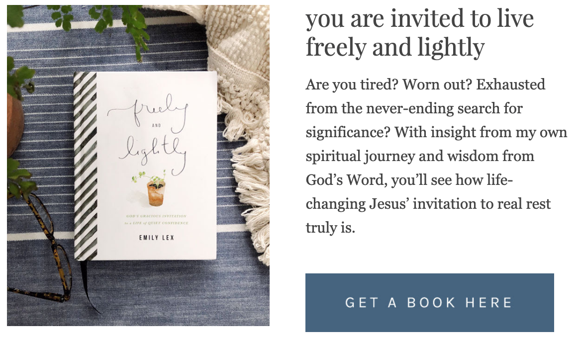
In my first book, Freely and Lightly, I shared my story of how learning to trust in who God is and who He says we are results in the true rest and peace we’re all in search of. It has been met with such a kind response and – even better! – so many of you have shared the ways my vulnerable words have made you feel seen and understood and encouraged to take a deep breath and continue on asking questions, finding answers, and resting in God’s goodness and love for you.
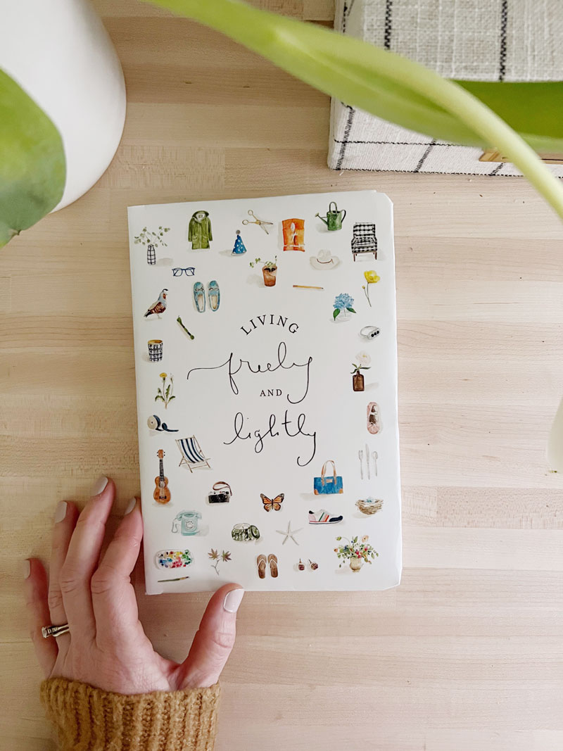
I’m so excited to tell you about my newest book, a lovely little companion to F&L, called Living Freely and Lightly.
Living Freely and Lightly guides you through each step of your identity journey with thoughtful questions that gently challenge, prayers to start a conversation, scripture verses to encourage, and plenty of space to reflect and process as you go deeper and invite Jesus’ transforming power to work in you. My desire in creating this journal was to find a way to take you through the same process I went through, made especially for those of you who do not naturally do this on your own.
I look forward to sharing much more with you about the journal … but today, let’s talk about the cute cover!
the cover
Since I am definitely a person who judges a book by its cover, I think it’s fun to share with you all the behind-the-scenes of designing one.
After we had our title, but before the journal was actually written, we began brainstorming ideas for the cover. My publishing company is so kind to ask about my wishes for the cover and allow me to give my opinion and make suggestions along the way. I’m truly so grateful.
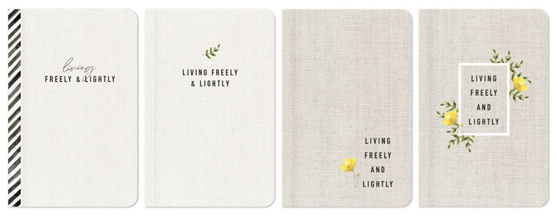
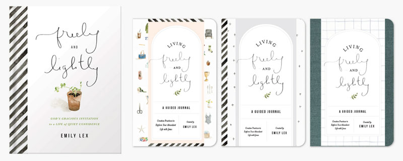
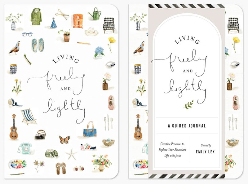
The designer then came up with a few initial designs:
Loved the linen, loved the simplicity, but they didn’t totally feel like a companion to the book … so we kept going.
Here was round two:
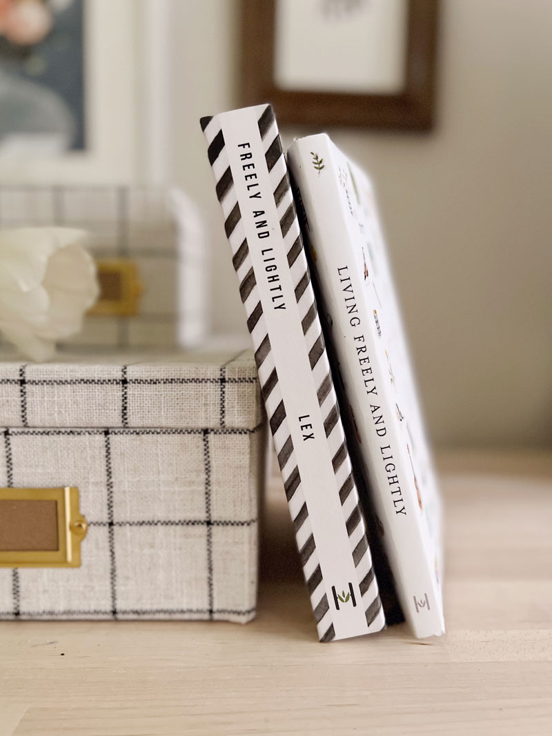
It was helpful to see the designs next to the book to see how they coordinated.
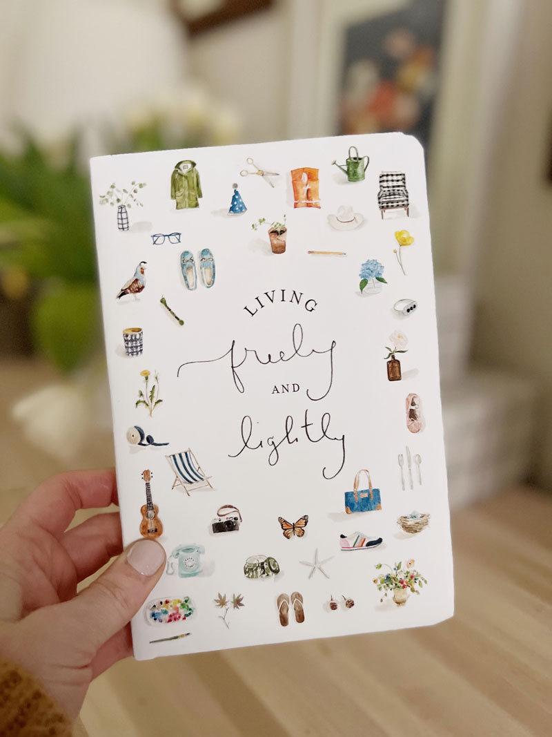
There will be an o-wrap (maybe that’s what it’s called?! Or a belly band?!) anyway, there will be a piece of paper that wraps the journal to hold all of the bookstore details. It will be removed once you start using it, so we wanted the journal to be great both with the wrap and without. All three designs totally work (I actually really love the peacock blue one), but it felt like pulling inspiration from the end sheets of F&L (seen here) felt the most special. And maybe most eye-catching, which is always good for those book-cover-judgers like me.
After tweaking the artwork arrangement and adjusting the color of the wrap, here’s where we landed:
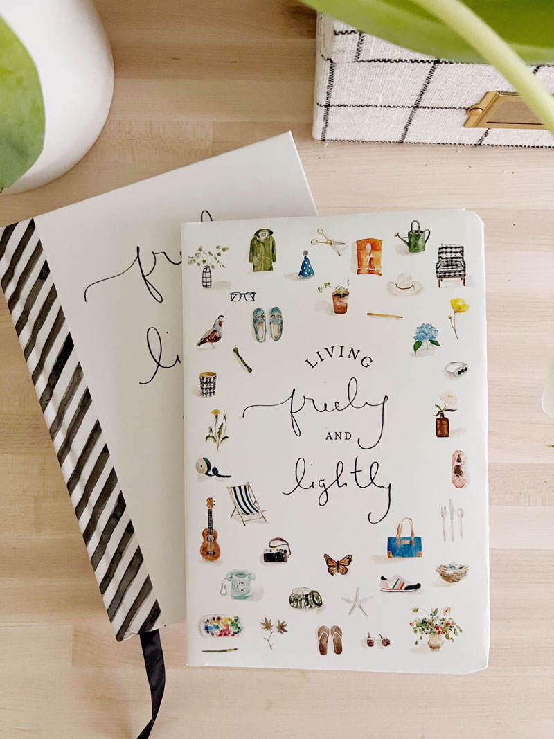
Isn’t it wonderful?! I love all the artwork. And love the tiny stretch of stripes as a nod to the book.
The final cover will be printed on linen book cloth which makes me so happy (I really love how it makes it feel so special!) and there will be ribbon bookmark (because a ribbon bookmark also makes it feel special!).
We’ll definitely be talking much more about this journal (can’t wait to show you the inside pages!) as well as special gifts you’ll get when you preorder. Details to come!
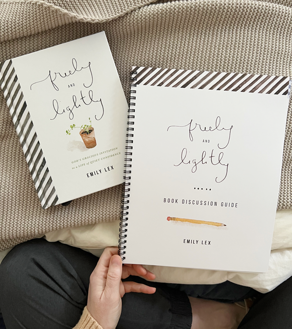
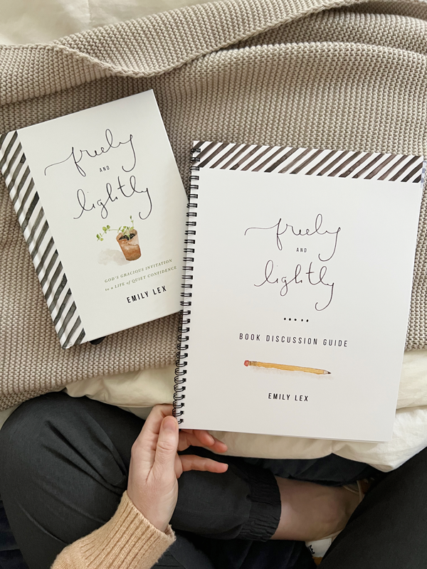
Last spring, two of my dear friends joined me in hosting a group of young women to read and discuss Freely and Lightly. It was a touch intimidating as the author of the book who shares pretty vulnerably, but it turned out to be the sweetest time of connecting, releasing, praying, and reorienting our life towards living freely and lightly.
This fall, another dear friend took her small group of young women through Freely and Lightly. I was talking to her last weekend and she mentioned that the discussion guide was so helpful and it reminded me … I NEVER GAVE IT TO YOU!
Last year as part of the book launch, my editor and I created a Book Discussion Guide with a quick summary, thoughtful questions, a prayer, and scripture for each chapter.
If you read Freely and Lightly on your own, it is a great place to go a little deeper.
If you read Freely and Lightly in a group, it is a helpful resource to direct your questions, stay focused and move the conversation along.
The guide is 42 pages and covers all 20 chapters. You can print it at home or take it to a local print shop to have it printed and spiral bound (that’s what I did).
This guide is for personal use only, for use in your home and with your reading groups. Please do not mass print, sell or distribute it.
Enter your email below to get the free reading guide:
[optin-monster-inline slug=”jisflnpsby6uljepnawn”]
One more little thing:
It has been one of the greatest surprise delights this past year to meet with our small group of young women. When I was in my early 20’s and 30’s, I longed for someone in the next season of life to hang out with. I never really found that person and so it is such an honor to be that for these ladies.
If you are older, perhaps see if you can find a group of young women to lead through this book (or any other!).
If you are a young woman, don’t be afraid to ask an older woman to lead you and a group of friends through this book (or any other!).
This is one of the beautiful ways we can connect with each other.
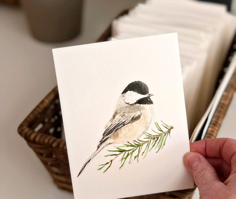
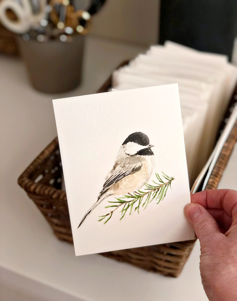
I’ve been working on a few new illustrations for the Christmas season and this little chickadee is one of them!
A few things about this painting (and my painting style in general):
1. I use a photo for reference. It’s off to the side of the video, but it’s there. I need it to figure out how to sketch, how to shade, how to do proportions. There’s no shame in referencing a photo.
2. I paint in lots of layers, building up color, texture, contrast as I go. The paintings start so dull (because I start with light colors first!) and as the darker shades are added, the artwork comes to life. That’s why watching to the end of the video is so satisfying.
3. I like painting small. I cut a piece of watercolor paper down to 5.5 x 4.25.
4. Sketching this birdie took me 4 minutes, painting took 24 minutes. That’s one of the benefits of painting small!
If you have any other painting-related questions, I’d love to answer!
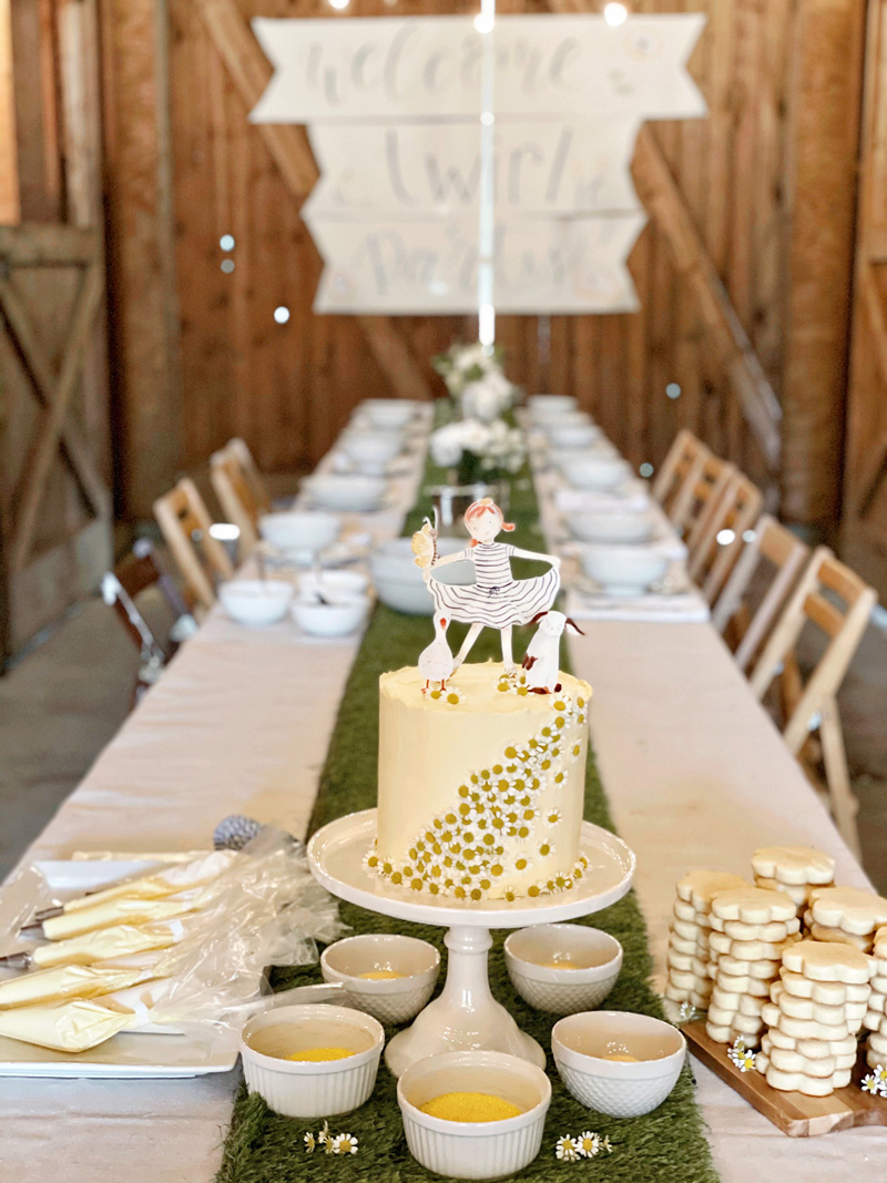
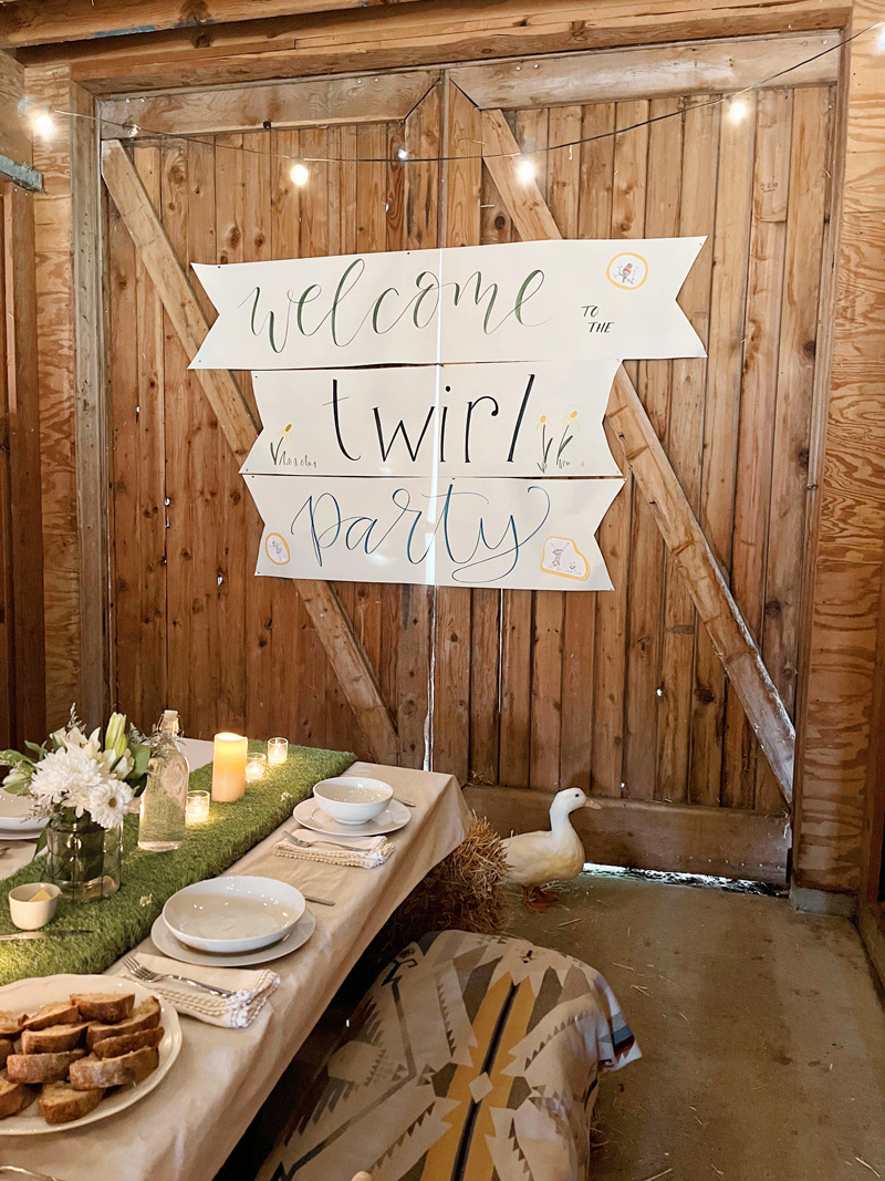
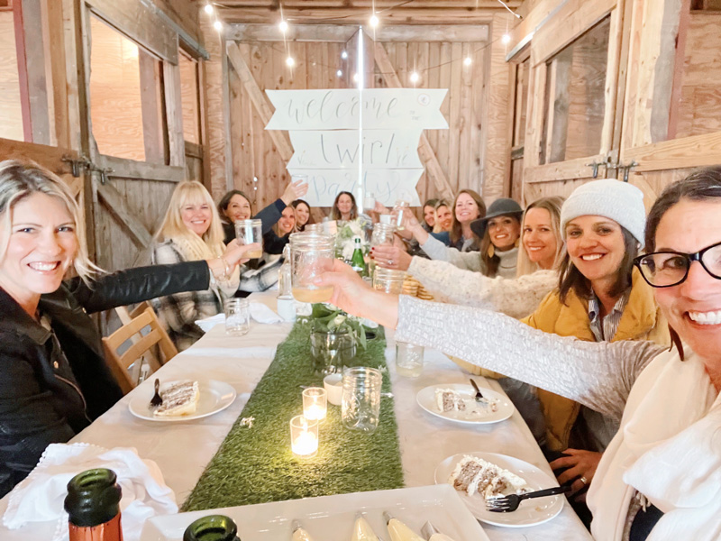
My friends know that I do not love being the center of attention and that I feel awkward on my birthday. But they also know that this Twirl book is one of the most wonderful and hard-won things I’ve ever done and they didn’t want to miss an opportunity to mark it with a celebration. So they combined their incredible creative, baking, cooking, hosting talents and threw a very thoughtful birthday/twirl party.
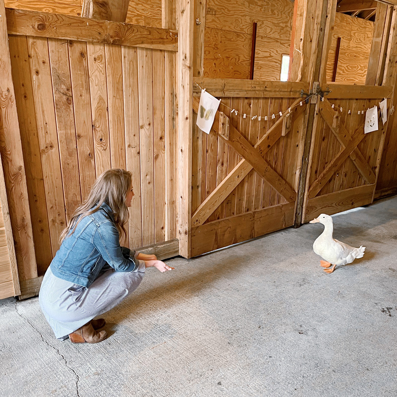
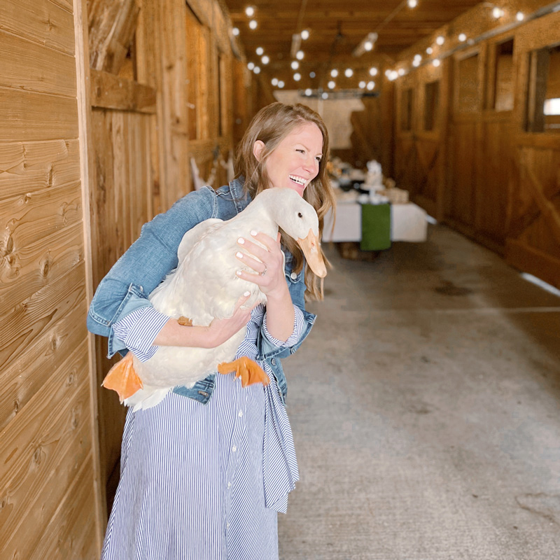
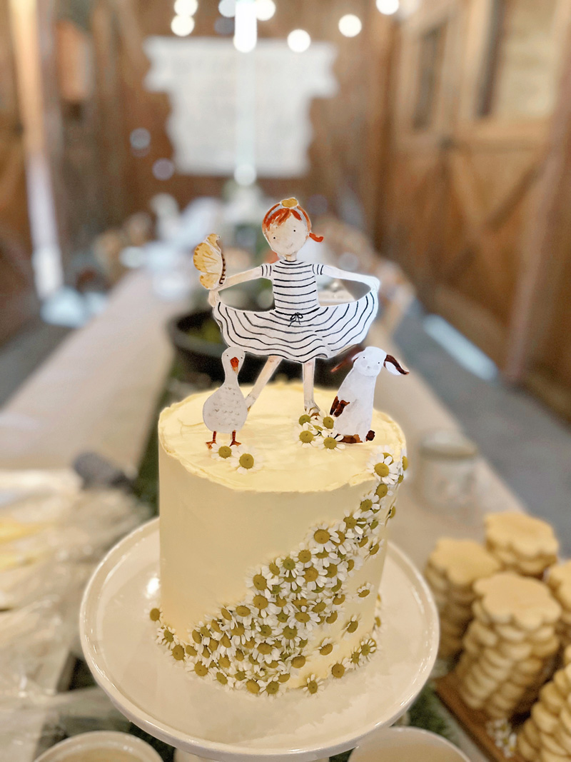
When I walked into my friend’s barn (isn’t it fabulous?!), of course I was delighted by the table set up and the cake and sparkly lights … but then I saw a duck! A real-life Mr. Duck from the book!
How adorable is he?!
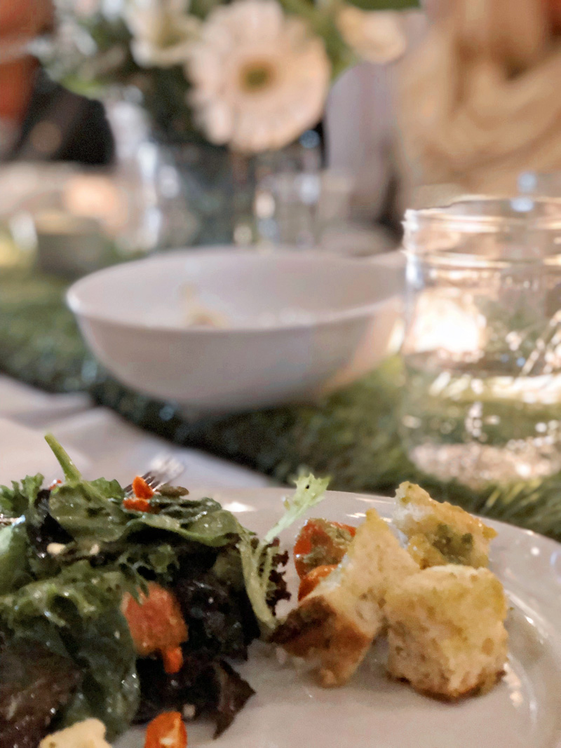
We visited and ate delicious fall food (which happens to be my favorite!). Yummy soups and salad and rustic bread and a Panzanella salad that I must remember to ask for the recipe.
And then they put me on the spot in the most tender way with thoughtful words about our friendships and what they see in me. Even though it is hard to just sit and listen to such nice things being said (I want to crack a joke! Or tell them to stop!), I truly tried to receive each kind word. Twirl is a story I’ve had in my heart for so long and not just one I made up on a whim, but a lesson I’ve had to fight hard to learn. To hear these ladies acknowledge that they see this in me feels so encouraging.
We cheers-ed over the most delicious hummingbird cake made by my very talented friend and decorated so adorably with little Twirl characters and cascading daisies.
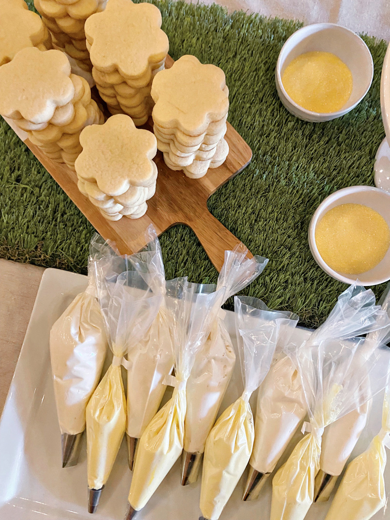
This same baker friend makes the best sugar cookies and one of my favorite things is having her teach us how to decorate them. I wish I had pictures of the finished product! They were cute little frosted daisy cookies.
I feel so grateful for these women in my life. It is one thing to learn to twirl in my own special way; it is another to twirl alongside women who are doing their own twirling so beautifully as well. We don’t have it all figured out. We’re still growing and learning and confessing and encouraging. But isn’t life so much sweeter when done with friends?
My heart is full. It was such a special birthday – the best one I’ve ever had.
If you haven’t ordered a copy of Twirl yet, you can grab one here. Thank you so much for all of your kind support for this book. May it be a delightful reminder to all who hear the story that you are perfectly and wonderfully made.


 \
\