For as long as I can remember, I have loved the illustrations in picture books. I remember staring at all the little details, looking at each page for much longer than needed, and yet absolutely captivated. What an honor it is to get to create illustrations that children will enjoy, notice details, make up stories about, choose favorites, trace, be inspired by … I’m truly so grateful I get to do this work!
So let’s get into it! Here’s a peek at how the illustrations for Build came to be.
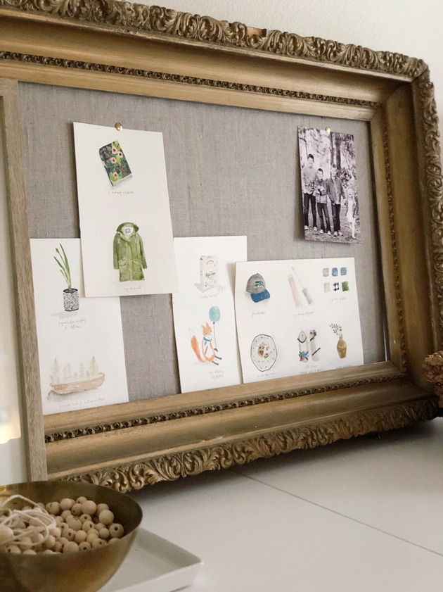
the illustration process
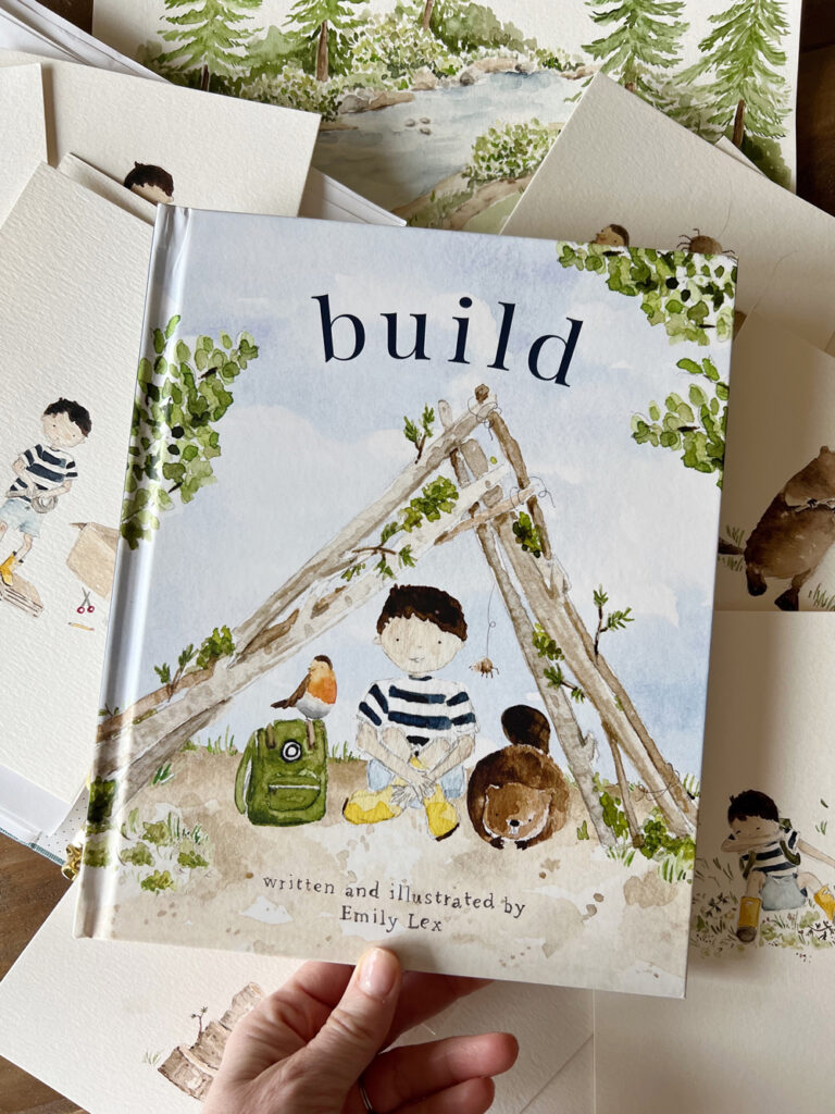
Because Build is the sibling book to Twirl and their formats are so similar, it made the process very easy! The layout is nearly identical to Twirl so I was able to follow along with the same template I made the first time around, with just a few minor changes to fit this story best.
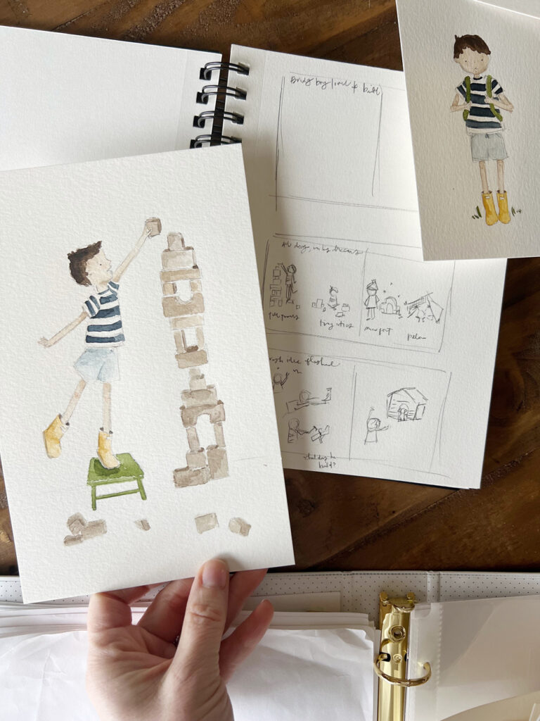
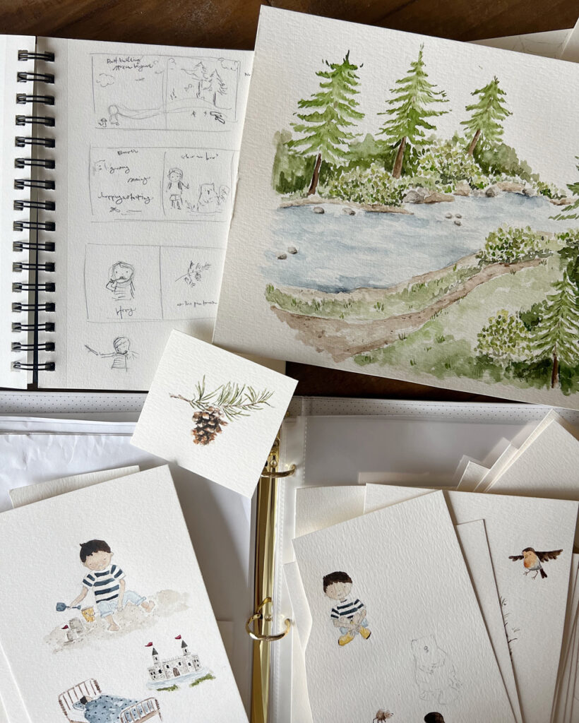
One of the best parts about being the author and illustrator is that while writing the story, I had pictures swirling in my mind. In my sketchbook, I drew very rough sketches of each page just to get my ideas down on paper. When it came time to actually translating what was in my mind to paper, I started by creating a page layout in Adobe Illustrator, adding the words and leaving the rest blank where the illustrations would go.
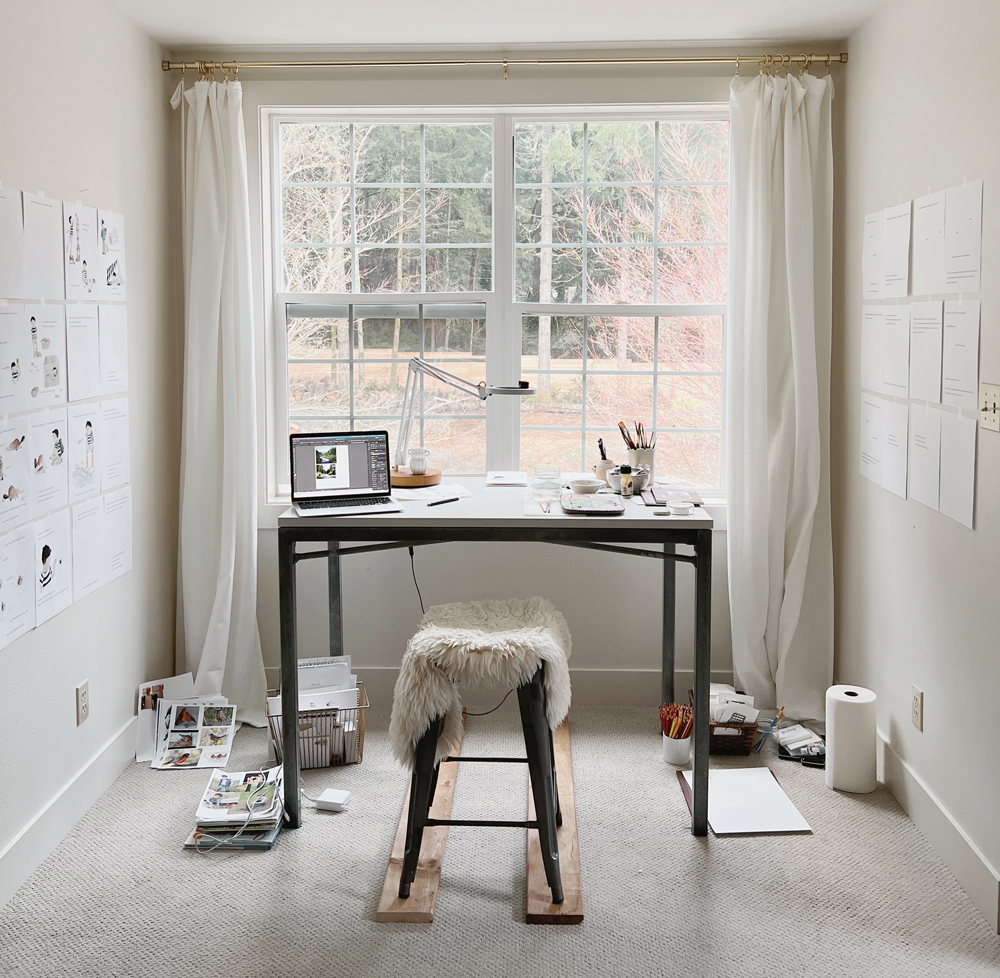
At my watercolor desk, I taped up all the blank pages to the wall. When a new series of illustrations was complete, I scanned them, edited them slightly, and added them to my Illustrator book document to print out. As more of the story came to life it was so nice to have it all up on the walls around me to help me watch progress, make sure the colors and characters looked consistent, and see how much was left to finish!
All of my artwork is done with paper, pencil, and watercolor paint. Once the illustration is finished, I scan each painting at a very high dpi to ensure the quality will remain crisp when printed. Next, I open the image in Photoshop to remove the background and make any minor edits (erasing extra markings, isolating objects, maybe shifting an eye over a tiny bit to make the character look happier). One thing you’ll notice in the pictures is the imperfection of hand-drawn art – little pencil marks, the paint bleeding and pooling, etc. With much of the artwork on children’s books moving to being digitally created, I feel really happy with the hand-made nature of the illustrations in this book. I hope there is a classic, nostalgic, and approachable feel to each page.
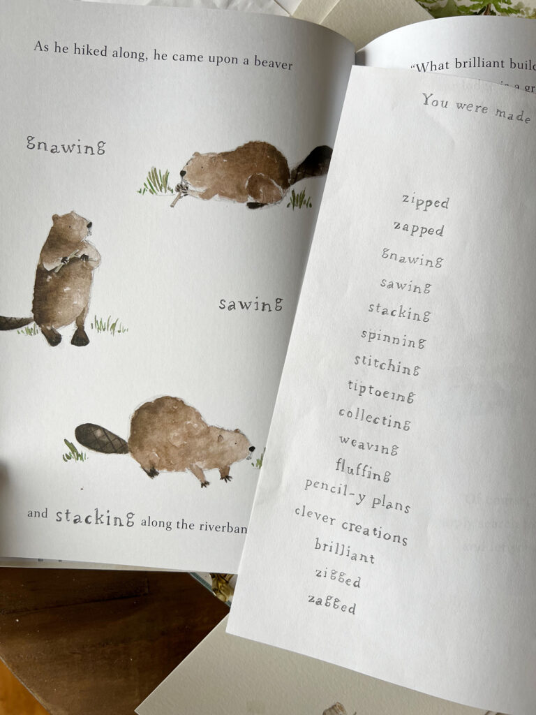
My style of art is so airy with lots of white space so you’ll notice that most of the artwork in the book are ‘spot’ illustrations – without a background scene. The one full-page spread with a background sets the scene for where this adventure takes place and I hope it stands out among all of the whitespace in the other illustrations! It was fun to create that scene and makes me want to venture more into landscape painting.
illustrating the characters
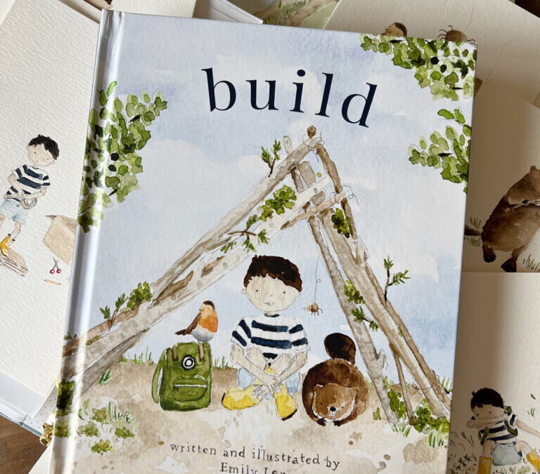
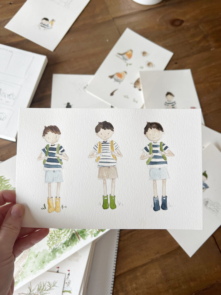
Even though our main character’s name is Brady boy (named after our second son), Build is wholly inspired by my husband and all three boys and you’ll find little nods to each of them throughout the book, both in words and pictures. It felt right to give him Ryan’s hair and skin coloring, and I dressed him in things my boys wore when they were little – a striped t-shirt (that coordinates so adorably with Audrey girl’s dress in Twirl!), easy shorts, yellow rain boots. Even his little backpack is inspired by my oldest son’s!
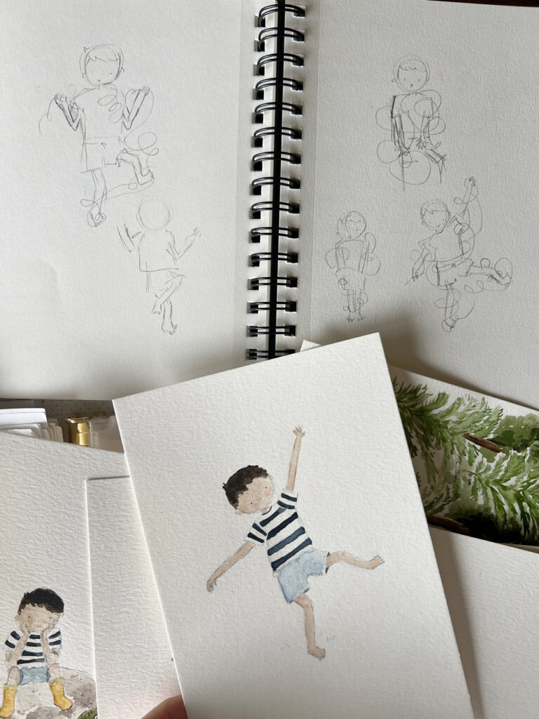
The animal friends were fun to dream up. I used a ton of reference photos to figure out what each animal looks like and how they move so I could try to make them look natural.
Itsy Bitsy Spider took the longest to get just right (even though she is so simple!). How do you make a spider look cute and not creepy?! Wide-set tiny dots for eyes, pink cheeks, striped legs, and a friendly brown color seemed to do the trick. Her spider web was drawn with pencil and I love the detail of her web in the pictures.
One of the trickiest parts about illustrating characters is keeping them consistent from page to page and from all different angles. One of the little tricks I learned is that keeping the clothes and accessories the same throughout the story helps a child identify the character and the imperfections in proportion, eye placement, etc. are much less noticeable!
When it came to movement, once again, I followed the same strategy as with illustrating twirl and used reference photos. What does a little boy look like sitting crosslegged building legos? What about sneezing? Or tangled up in string? Sometimes I moved my own body into a pose to figure out what a body does and that was helpful too 🙂
all the extras
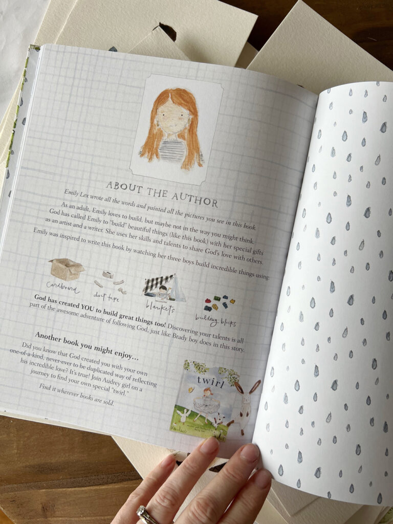
You know how much I love paying attention to little details and this book is no different. You’ll find cute end sheets (I love cute end sheets!), a sweet bible verse, a dedication, and an about-the-author page. My publishing team was so creative with the suggestion for the about the author page and I hope it brings one last smile before you close the book. These special pages were so fun to create!
Just like with Twirl, I was able to incorporate hand lettering into the pages of Build. The sketchy pencil, rubber-stamp-inspired letters make this book feel even more playful, personal, and full of imperfect charm.
Writing and illustrating Build was a dream come true for me and such an incredible experience. I hope this was a fun peek into the illustrating process. If you have any questions, please leave a comment and I’d love to answer!
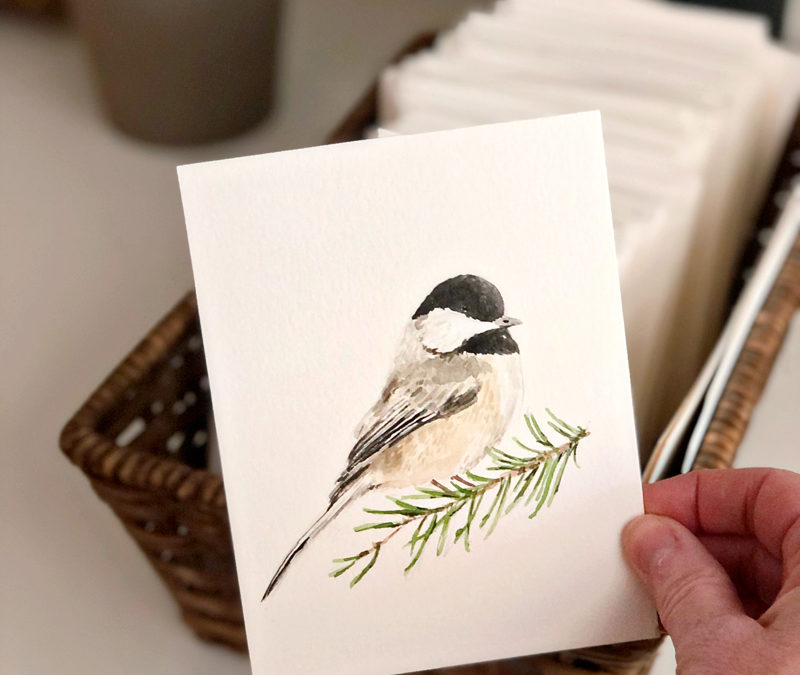
I’ve been working on a few new illustrations for the Christmas season and this little chickadee is one of them!
A few things about this painting (and my painting style in general):
1. I use a photo for reference. It’s off to the side of the video, but it’s there. I need it to figure out how to sketch, how to shade, how to do proportions. There’s no shame in referencing a photo.
2. I paint in lots of layers, building up color, texture, contrast as I go. The paintings start so dull (because I start with light colors first!) and as the darker shades are added, the artwork comes to life. That’s why watching to the end of the video is so satisfying.
3. I like painting small. I cut a piece of watercolor paper down to 5.5 x 4.25.
4. Sketching this birdie took me 4 minutes, painting took 24 minutes. That’s one of the benefits of painting small!
If you have any other painting-related questions, I’d love to answer!
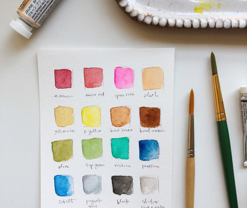
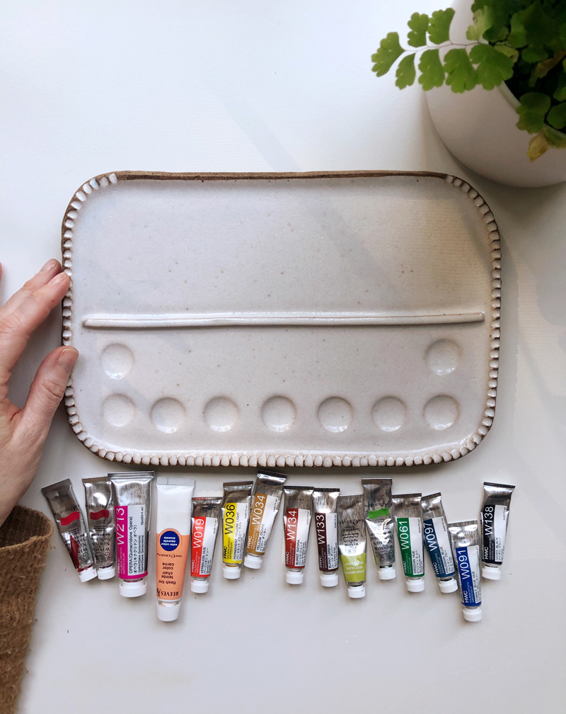
The more I paint, the more I realize I have go-to colors I reach for again and again. Instead of having tons of paints in a palette that don’t ever get touched, I decided to streamline my colors and just add the ones I regularly use.
There are so many different options for watercolor paints at all different price points and I always recommend just starting with either what you already have on hand or picking up the best quality set you can find in your price range. I have a few of my favorite beginner sets picked out for you on the Watercolor Supplies page.
I painted with an inexpensive set of cake watercolors for years before switching to tubes. Tubes of paint are more expensive, but also more saturated, better quality paints that offer truer colors, better translucency, and mix well. I paint pretty much exclusively with tube paints now. I mainly reach for Winsor and Newton and Holbein. I haven’t done a ton of experimenting with different brands and qualities of paints, but I can say I’m really happy with the professional grades of both of these brands.
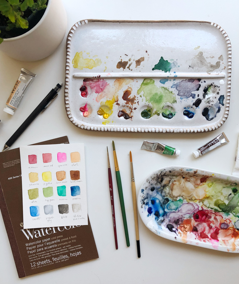
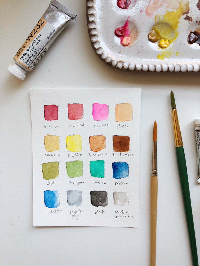
I thought it would be fun to share with you the exact colors I use and how I set it up!
This gorgeous palette is from Sylvan Clayworks. It is handmade and beautiful in person and I was SO EXCITED when I finally got one! They are restocked every couple of months and sell out in minutes so make sure you join the Sylvan Clayworks email list to be notified first when the restocks happen. I have the medium palette.
I like an assortment of all colors – reds, peach, yellows, browns, greens, blues, and black and have picked my very favorites to put on my palette. With just a few colors, you can mix almost every other color and I really do love the process of mixing so it works well for me to just have a few options.
P.S. The way tube paints work … you just squeeze out a little bit on a palette (a dinner plate works great!) and let it dry overnight. To use, just activate the paint with water, mix directly on your palette and when you’re done painting for the day, just let it all dry. You can reactivate with water or wipe it off with a wet paper towel if you need more room to mix. You can see below what one of my older palettes looks like:
In late November I sat on my closet floor praying. There were tears, of course, because I cry easily and I was just so desperate to hear from God. I was struggling with what to do and how to move forward and I needed clear direction. If 2018 was anything for me, it was the year of finding freedom. September, in particular, was the month where much of that healing finally happened and it left me asking the question, what now?! Now that I was free of lies and finally found the answer to my four-year question of WHO AM I, I just needed to know what to do next.
God was so gracious to answer me gently and He spoke to my heart right there on that closet floor:
Be an artist.
It wasn’t really shocking, this Be An Artist directive. After all, I love creating and decorating and painting and making. I’ve always loved these things. I have even built a business around doing and sharing and teaching my favorite creative endeavors. But that’s not what He said. He didn’t say, DO art. He said BE an artist. As much as I love doing art, teaching art, admiring art, I have never truly identified as an artist. Artistic, sure. Creative, yes. But in a million years I would never introduce myself as Emily, the artist. And I think that was the problem.
Deep, deep down in the truest part of me, I am an artist. I always have been. But instead of living confidently in that, I’ve tried to be other things and pushed the artist part way down. Being an artist felt silly, unimportant, less-than. What really mattered, especially in this online business that I run, was consistency and growth and strategy. And all of that – while super important for running a business – became who I was trying to be and the work I was trying to do and, honestly, it just wasn’t working. Not only was I not good at it, but it was starting to burn me out. I became cynical, tired, uninspired, done.
That’s the thing: when you are not being who you are made to be, it drains the life right out of you.
To be totally fair to the situation, I had my husband and business partner who is very clearly the entrepreneur/growth/strategy person right by my side. I didn’t really need to try to be the business-y person I was trying to be, but I felt like its what everyone wanted from me and expected from me and the right thing to do and I’ll do anything in my power to not disappoint. So I played the part – or at least tried to – and there’s been this gnawing tension that I couldn’t resolve ever since. My answer to this persistent tension, unfortunately, was throw it all away! which is clearly not the right answer. I’m so good at swinging the pendulum far and wide and this was just another example of it. Which lead me to that morning in November, crying on my closet floor asking for God to please, please, please help me figure this thing out.
Be an artist, He said.
It was so clear and concise and I had no desire to ignore or dismiss it. I just wanted to obey. So I pulled out my watercolors and started a new painting.
This is where I’d love to say that my heart was instantly at peace because FINALLY, I was living into my true identity!
But instead, this is what happened:
I was almost finished with the flower bouquet I was painting and stopped for a second to run upstairs. What for I can’t remember but what I do remember is thinking to myself as I climbed the stairs, that painting is terrible. I’m not an artist. I don’t even know what I’m doing. How quickly I had forgotten what God said of me! A few minutes later when I came back downstairs, Ryan was looking at the painting and showered me with compliments. This painting is amazing! How did you do that?!
The contrast was not lost on me.
I could choose to be hard on myself, to compare, set unrealistic expectations and give up OR I could live into the identity God gave me, listen to positive voices from people who love and care about me and just keep trying. This whole ‘renewing your mind’ thing is real, my friends. What voice would I listen to? The one telling me I was terrible? Or the one saying, “this is who you are, now be it.”
I worked a little more on the flower painting and when I shared it, the response was so kind. It helped boost my confidence. I did a couple more paintings in December, but it was a busy month and you know how that goes.
So at the end of the month when this idea popped into my head about doing a daily sketch each day in 2019, it felt like the right next step. It would mean I was walking in obedience to be an artist. It would mean I would be practicing art every day and surely would improve. It would mean I could build up more confidence to create illustrations for the books I will write someday. It would challenge me to look beyond the camera for capturing beauty in the every day and go an extra step to paint it.
And so the daily sketches began.
I’m using the hashtag #thisismydailyart on instagram to categorize the paintings. It always makes me smile when I think about this song I grew up on. This painting practice feels a little like daily bread. It feels like sustenance for my soul that is coming from the Lord. It’s an act of worship, this living into my true identity thing. It’s an act of trust and obedience and while it’s vulnerable and risky, it feels like the very best and most joyful thing I can do.
I am sharing the sketches each day on Instagram partially for accountability and partially because part of being an artist is sharing that art with the world. You can see them all right here.
Those daily posts mean that my Instagram account looks different than it has in the past. From a professional standpoint, that feels terrifying. Anytime you stray even slightly from what you’ve been doing, the chances of losing followers are good. But, I remain sure that this direction for me is right and I’m so grateful for the sweet comments and encouragement I have received since the beginning.
And here’s my encouragement for you:
Trust in who God made you uniquely to be. Then be it.
If you are not quite sure who you are, oh, friend, this is the greatest work you can do. Ask Him, pay attention to your dreams and little girl aspirations, look for what makes you excited, motivated, energized. You will find her. You really will.
I told myself I wouldn’t start over. If the shading was weird or proportions not quite right I just wouldn’t worry about it and remember that this daily practice is for PRACTICE. Up until this sketch, there has only been one other time when I was tempted to start over.
But I talked myself out of starting over reminding myself of the reason for me doing this. I posted to Instagram and sure enough, it is one of the most liked daily sketches so far.
This little lesson boosted my confidence and resolve to just let this be an exercise in painting and not worry about perfection.
And then earlier this month, I totally broke this resolve and started over on a sketch.
I had good reason to restart and I actually learned something good from it.
Let me tell you the story …
On this particular day, I had been in a bit of a funky mood right from the start. I couldn’t quite identify what the feelings were – sadness? anxiety? pms? I didn’t know. Instead of quieting myself and really paying attention to the feelings, all I wanted to do was put a podcast on, pop in my headphones and clean the house. I think it was my way of shutting out the feelings and adding order to the areas in my life I could control. Healthy? Maybe not. But it keeps the house looking good!
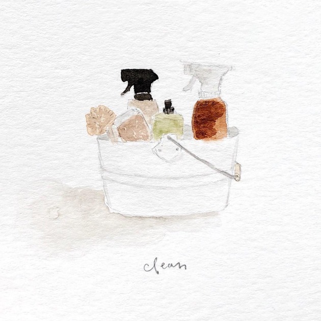
Anyway, when it came time to sit down to do my daily sketch, I did like I do most days and chose something that represented a piece of that day. A cute caddy of cleaning supplies seemed like just the right subject matter.
I sketched the items and added paint to all of the little cleaning bottles. When I got to the last part – painting the caddy – I paused. My inspiration and the plan all along was for the caddy to be white. But I started second-guessing myself.
All of my sketches are so neutral. Color would be more eye-catching. I’ll get more likes if it’s colorful. People are probably bored of all my neutrals.
I was planning on keeping the caddy white but instead decided to go completely bold and do it red.
From the second the paint hit the paper, I hated it.
I’m not a red girl. I’m not a bold color girl. I’m not a red cleaning caddy girl.
I tried to like it. Then I tried to remove the paint in an attempt to fix it. But it just became a soggy, pink mess.
I had to start over.
On the second try, I went with my gut and kept the caddy white.
Yes, it’s neutral. It is subtle and dainty and doesn’t pop the way it might if it were a bold color.
But I love it. It feels like me and I’m proud of this little sketch.
I say it all the time and I guess I had just forgotten it myself: Do your thing. Don’t worry about what people think. Don’t do it for applause. Just do the thing in your own unique way and offer it freely to the world.