
illustrating build
For as long as I can remember, I have loved the illustrations in picture books. I remember staring at all the little details, looking at each page for much longer than needed, and yet absolutely captivated. What an honor it is to get to create illustrations that children will enjoy, notice details, make up stories about, choose favorites, trace, be inspired by … I’m truly so grateful I get to do this work!
So let’s get into it! Here’s a peek at how the illustrations for Build came to be.
the illustration process
Because Build is the sibling book to Twirl and their formats are so similar, it made the process very easy! The layout is nearly identical to Twirl so I was able to follow along with the same template I made the first time around, with just a few minor changes to fit this story best.
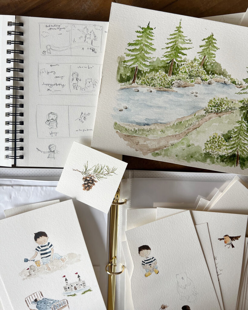
One of the best parts about being the author and illustrator is that while writing the story, I had pictures swirling in my mind. In my sketchbook, I drew very rough sketches of each page just to get my ideas down on paper. When it came time to actually translating what was in my mind to paper, I started by creating a page layout in Adobe Illustrator, adding the words and leaving the rest blank where the illustrations would go.
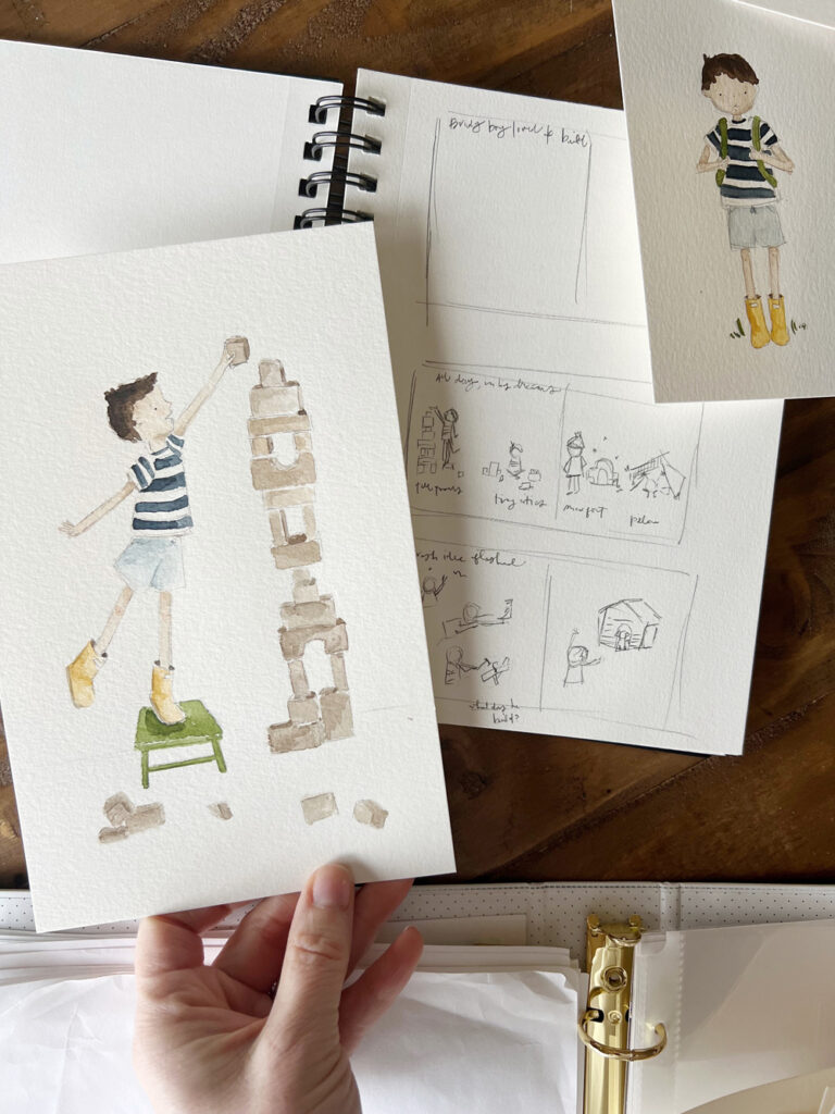
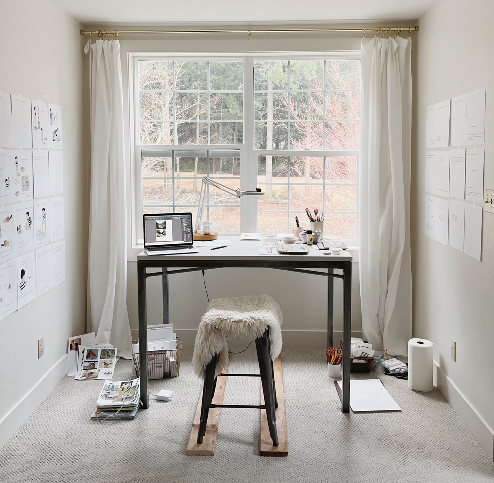
At my watercolor desk, I taped up all the blank pages to the wall. When a new series of illustrations was complete, I scanned them, edited them slightly, and added them to my Illustrator book document to print out. As more of the story came to life it was so nice to have it all up on the walls around me to help me watch progress, make sure the colors and characters looked consistent, and see how much was left to finish!
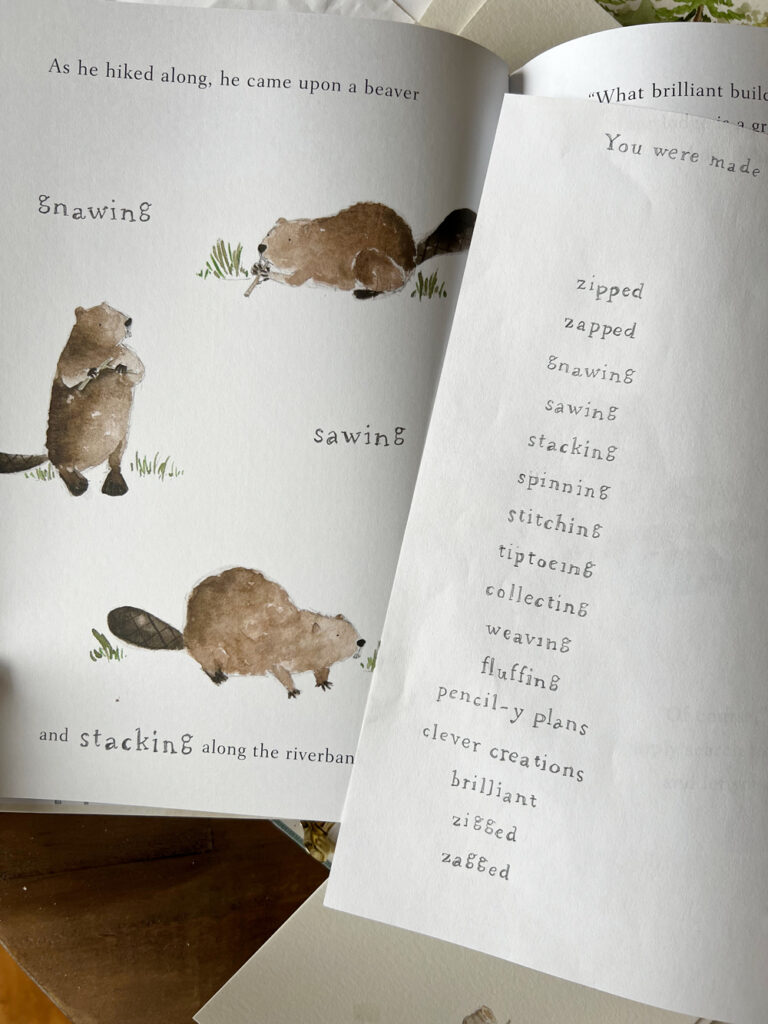
All of my artwork is done with paper, pencil, and watercolor paint. Once the illustration is finished, I scan each painting at a very high dpi to ensure the quality will remain crisp when printed. Next, I open the image in Photoshop to remove the background and make any minor edits (erasing extra markings, isolating objects, maybe shifting an eye over a tiny bit to make the character look happier). One thing you’ll notice in the pictures is the imperfection of hand-drawn art – little pencil marks, the paint bleeding and pooling, etc. With much of the artwork on children’s books moving to being digitally created, I feel really happy with the hand-made nature of the illustrations in this book. I hope there is a classic, nostalgic, and approachable feel to each page.
![]()
My style of art is so airy with lots of white space so you’ll notice that most of the artwork in the book are ‘spot’ illustrations – without a background scene. The one full-page spread with a background sets the scene for where this adventure takes place and I hope it stands out among all of the whitespace in the other illustrations! It was fun to create that scene and makes me want to venture more into landscape painting.
illustrating the characters
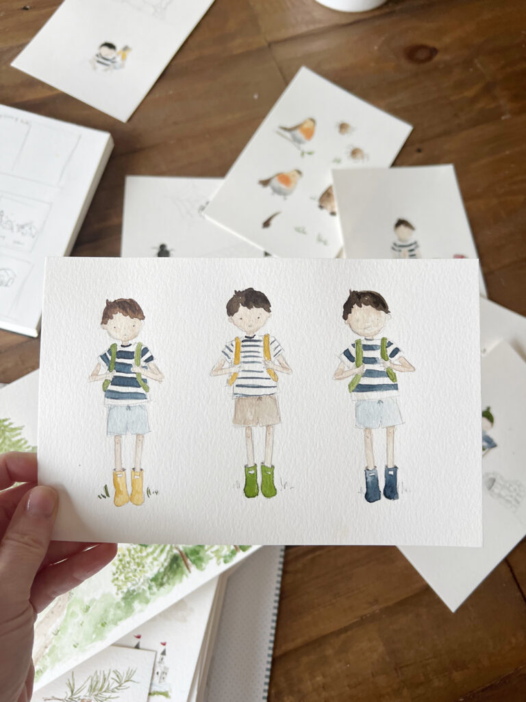
Even though our main character’s name is Brady boy (named after our second son), Build is wholly inspired by my husband and all three boys and you’ll find little nods to each of them throughout the book, both in words and pictures. It felt right to give him Ryan’s hair and skin coloring, and I dressed him in things my boys wore when they were little – a striped t-shirt (that coordinates so adorably with Audrey girl’s dress in Twirl!), easy shorts, yellow rain boots. Even his little backpack is inspired by my oldest son’s!
The animal friends were fun to dream up. I used a ton of reference photos to figure out what each animal looks like and how they move so I could try to make them look natural.
![]()
Itsy Bitsy Spider took the longest to get just right (even though she is so simple!). How do you make a spider look cute and not creepy?! Wide-set tiny dots for eyes, pink cheeks, striped legs, and a friendly brown color seemed to do the trick. Her spider web was drawn with pencil and I love the detail of her web in the pictures.
One of the trickiest parts about illustrating characters is keeping them consistent from page to page and from all different angles. One of the little tricks I learned is that keeping the clothes and accessories the same throughout the story helps a child identify the character and the imperfections in proportion, eye placement, etc. are much less noticeable!
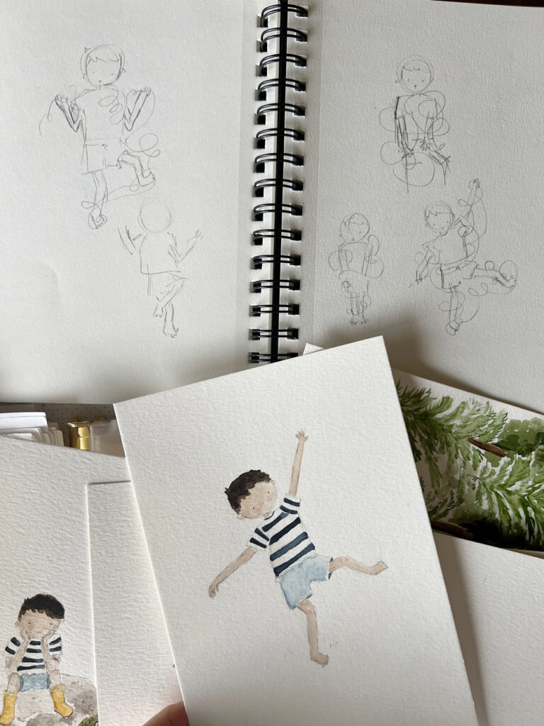
When it came to movement, once again, I followed the same strategy as with illustrating twirl and used reference photos. What does a little boy look like sitting crosslegged building legos? What about sneezing? Or tangled up in string? Sometimes I moved my own body into a pose to figure out what a body does and that was helpful too 🙂
all the extras
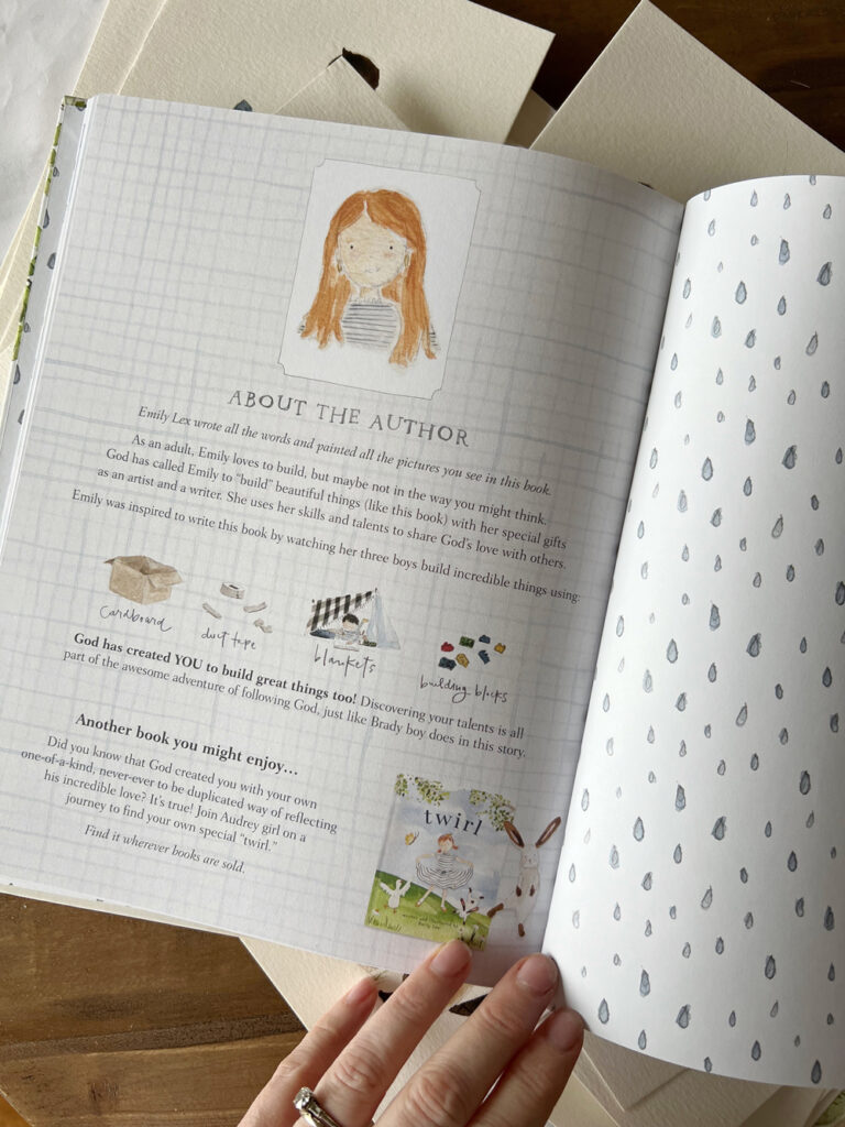
You know how much I love paying attention to little details and this book is no different. You’ll find cute end sheets (I love cute end sheets!), a sweet bible verse, a dedication, and an about-the-author page. My publishing team was so creative with the suggestion for the about the author page and I hope it brings one last smile before you close the book. These special pages were so fun to create!
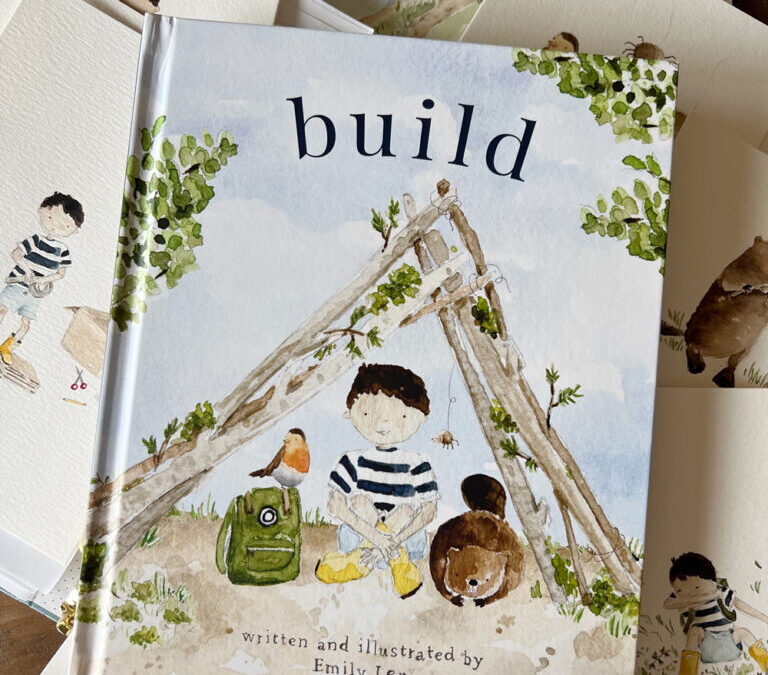
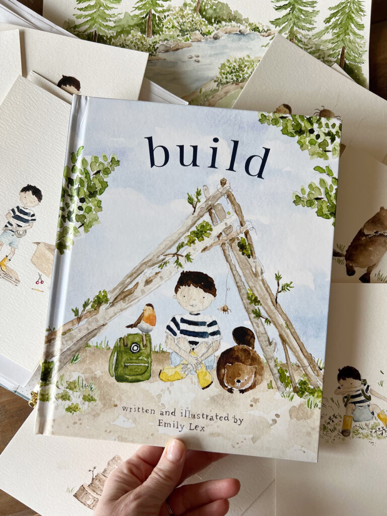
The cover came toward the end of the design process and you can read all about that here.
Just like with Twirl, I was able to incorporate hand lettering into the pages of Build. The sketchy pencil, rubber-stamp-inspired letters make this book feel even more playful, personal, and full of imperfect charm.
Writing and illustrating Build was a dream come true for me and such an incredible experience. I hope this was a fun peek into the illustrating process. If you have any questions, please leave a comment and I’d love to answer!