One of the greatest gifts I’ve been given is the opportunity to write and illustrate children’s books. My first picture book, Twirl, was my longtime dream come true project. Build followed with a dear-to-my-heart message made especially with boys in mind. And now I get to introduce you to a brand new children’s book, coming March 2025.
Meet Bedtime Blessings for Little Ones, a heartwarming picture book filled with delightful illustrations and sweet words of spiritual truth to fill young hearts and minds as they are tucked in to sleep.
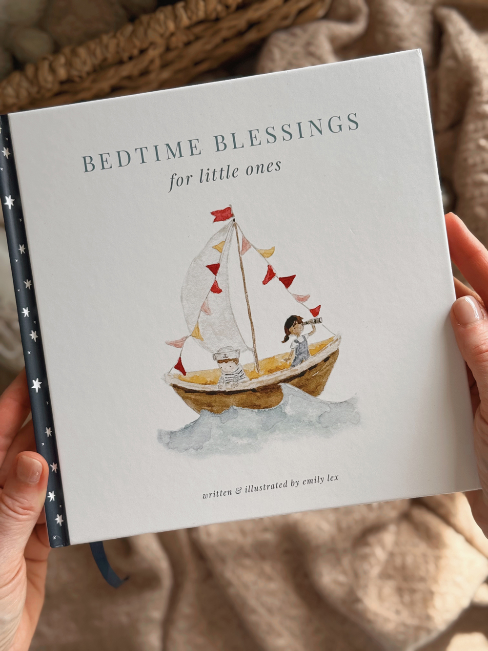
I can not wait to tell you so much more about this sweet book – the story behind the story, the process of illustrating and watching it all come together. But for today, let’s talk about the cover!
the cover
I’m one of those who chooses a book by its cover (you too?!) and it felt especially important for this book to have a darling cover. From the start of this project, I imagined this book facing out on a book ledge in nurseries or set out on nightstands next to cozy rockers to make reading a page each night easy. It’s for boys and girls so the cover needed to feel gender-neutral and classic as I hope this sweet book of blessings will pass down for years to come.
After submitting the manuscript and finished illustrations, my publisher came up with a handful of initial cover ideas. Their main objective was to clearly communicate the bedtime aspect of the book so they gravitated towards comps that had owls, stars and dark backgrounds.
Here is the first round of cover concepts from my publisher’s design team:
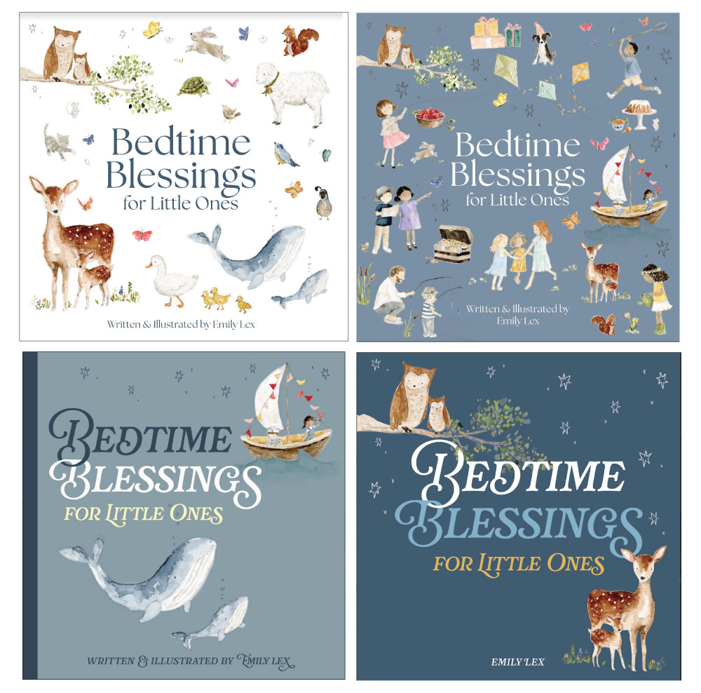
It is so fun to get these in my email and see what other designers come up with using my art!
None of these felt quite right, so I asked if I could come up with a few ideas just to give a clearer direction. Here are my cover samples:
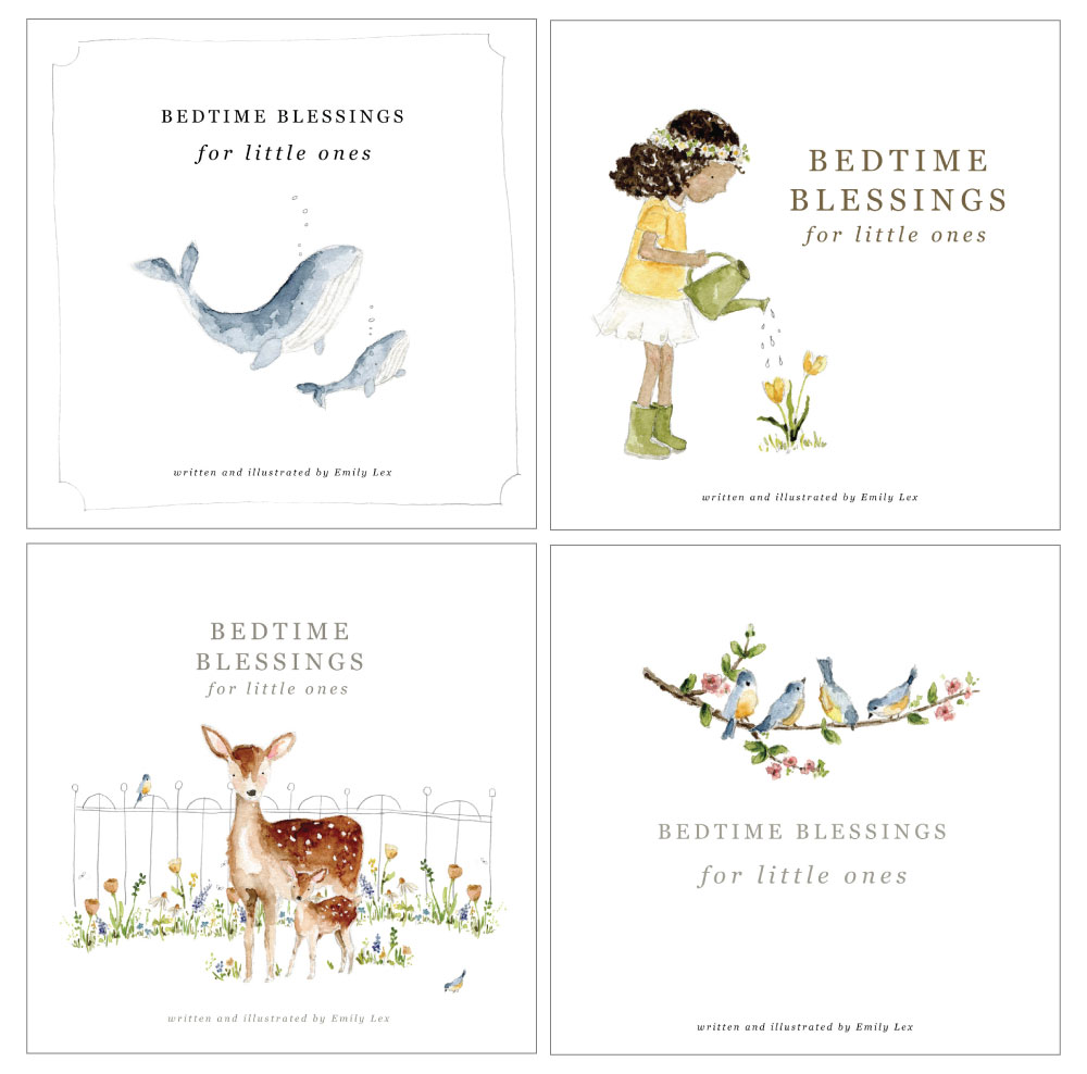
I’m drawn to lots of white and very classic fonts. It was good for me to come up with a few ideas just to clarify what my aesthetic was for the book. I’m so grateful that my publisher really wants me to love the cover and is willing to make lots of changes to get it just right! After seeing my ideas, the designer came back with another round of options:
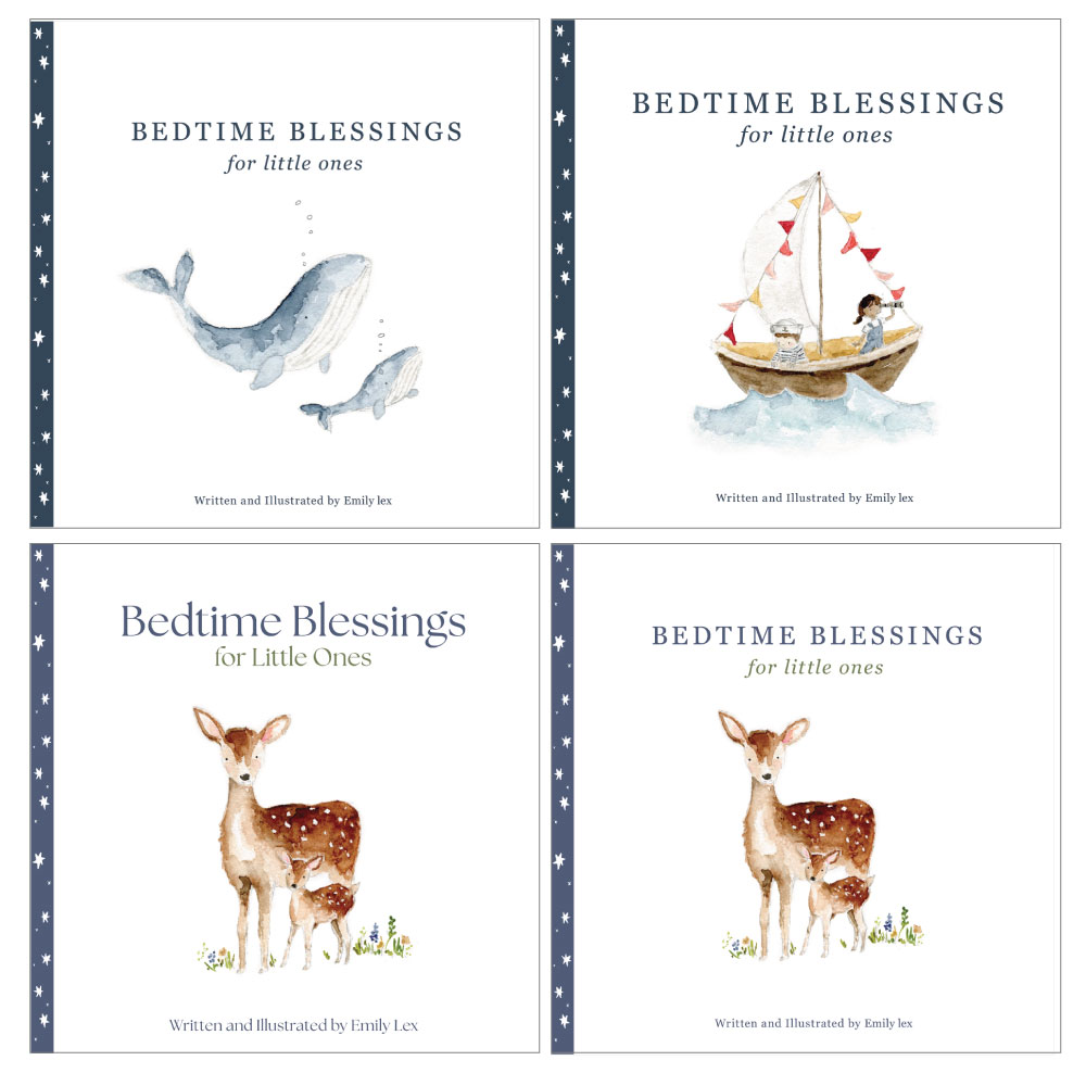
These new samples felt instantly right. I loved the added star border and it was just a matter of deciding which illustration was the best for the front. I asked a handful of friends and we all landed on the cute little sailboat explorers!
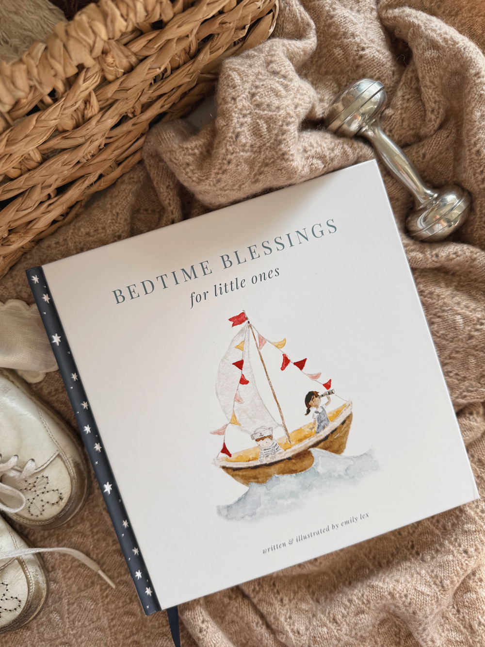
Once the main layout was decided on, we played with font selection and I feel so happy with how it turned out. It’s classic and simple and I hope it will look equally darling in a baby girl or baby boy’s nursery.
I’ll have much more to share about this sweet book that I am excited to do in the next few months before it officially releases March 4, 2025!
I’d love to answer any questions you have about the book or the process … ask away!

So excited that your book for little ones is coming out right when we’re due to have another grand baby! I got Twirl for my granddaughter & Build for my grandson, so this will be perfect for the new baby.