For as long as I can remember, I have loved the illustrations in picture books. I remember staring at all the little details, looking at each page for much longer than needed, and yet absolutely captivated. What an honor it is to get to create illustrations that children will enjoy, notice details, make up stories about, choose favorites, trace, be inspired by … I’m truly so grateful I get to do this work!
So let’s get into it! Here’s a peek at how the illustrations for Build came to be.
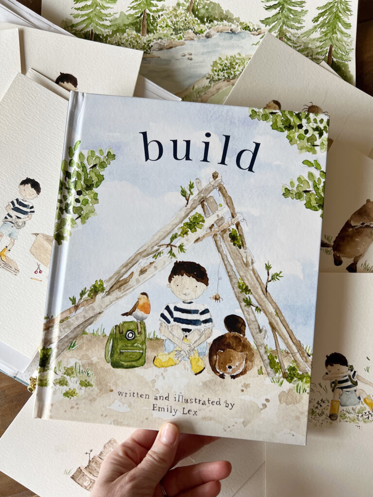
the illustration process
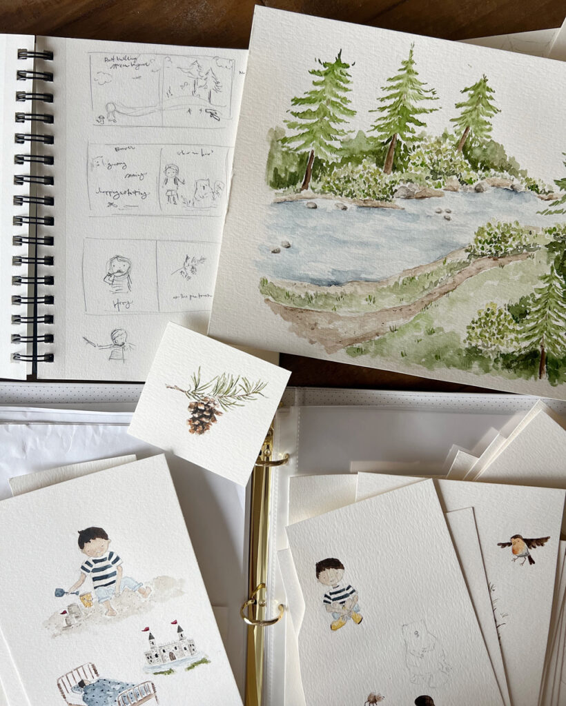
Because Build is the sibling book to Twirl and their formats are so similar, it made the process very easy! The layout is nearly identical to Twirl so I was able to follow along with the same template I made the first time around, with just a few minor changes to fit this story best.
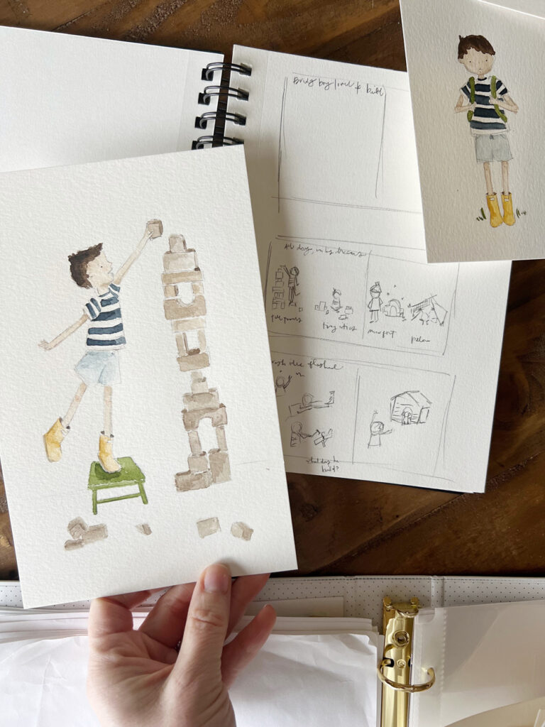
One of the best parts about being the author and illustrator is that while writing the story, I had pictures swirling in my mind. In my sketchbook, I drew very rough sketches of each page just to get my ideas down on paper. When it came time to actually translating what was in my mind to paper, I started by creating a page layout in Adobe Illustrator, adding the words and leaving the rest blank where the illustrations would go.
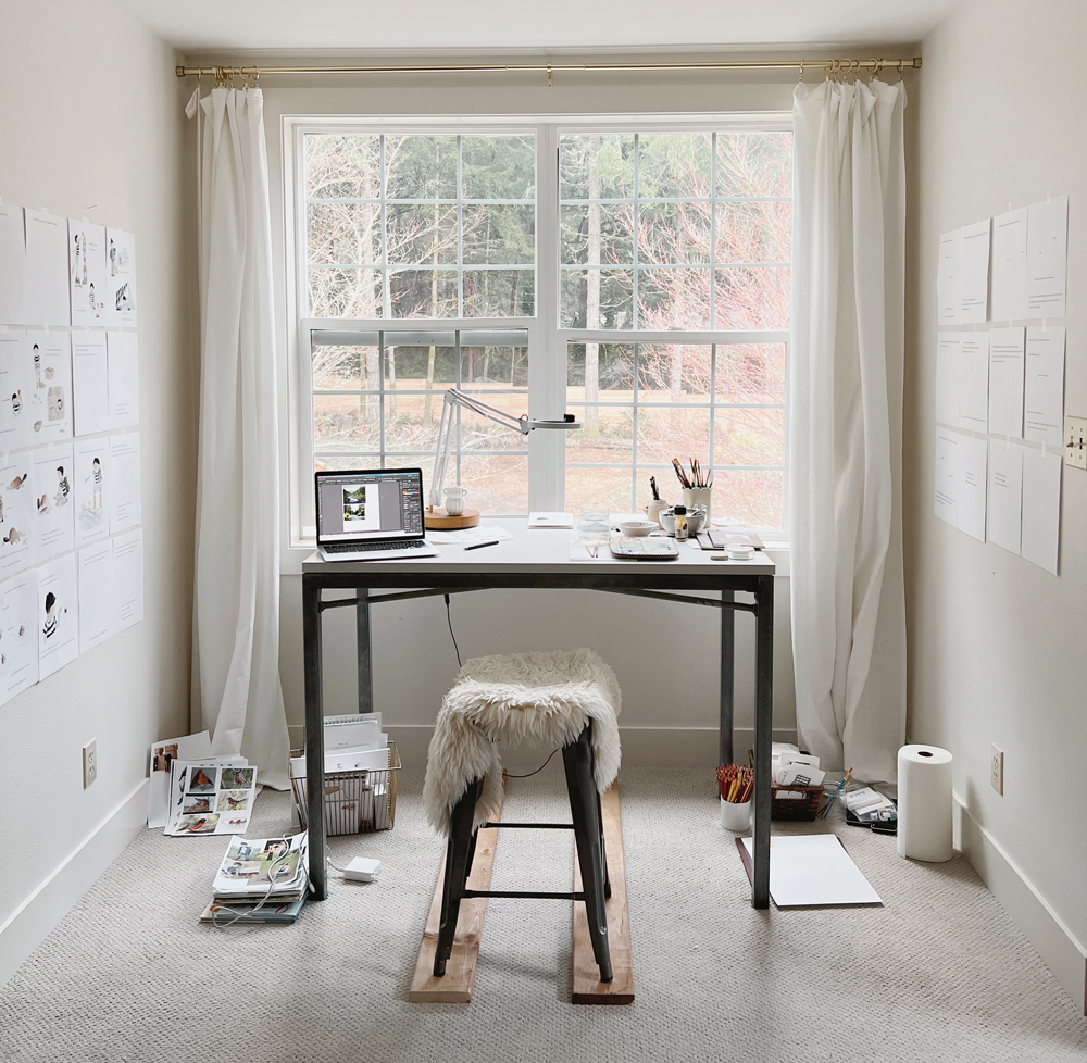
At my watercolor desk, I taped up all the blank pages to the wall. When a new series of illustrations was complete, I scanned them, edited them slightly, and added them to my Illustrator book document to print out. As more of the story came to life it was so nice to have it all up on the walls around me to help me watch progress, make sure the colors and characters looked consistent, and see how much was left to finish!
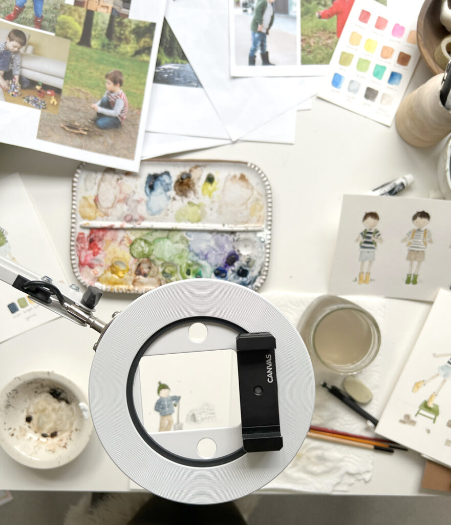
All of my artwork is done with paper, pencil, and watercolor paint. Once the illustration is finished, I scan each painting at a very high dpi to ensure the quality will remain crisp when printed. Next, I open the image in Photoshop to remove the background and make any minor edits (erasing extra markings, isolating objects, maybe shifting an eye over a tiny bit to make the character look happier). One thing you’ll notice in the pictures is the imperfection of hand-drawn art – little pencil marks, the paint bleeding and pooling, etc. With much of the artwork on children’s books moving to being digitally created, I feel really happy with the hand-made nature of the illustrations in this book. I hope there is a classic, nostalgic, and approachable feel to each page.
My style of art is so airy with lots of white space so you’ll notice that most of the artwork in the book are ‘spot’ illustrations – without a background scene. The one full-page spread with a background sets the scene for where this adventure takes place and I hope it stands out among all of the whitespace in the other illustrations! It was fun to create that scene and makes me want to venture more into landscape painting.
illustrating the characters
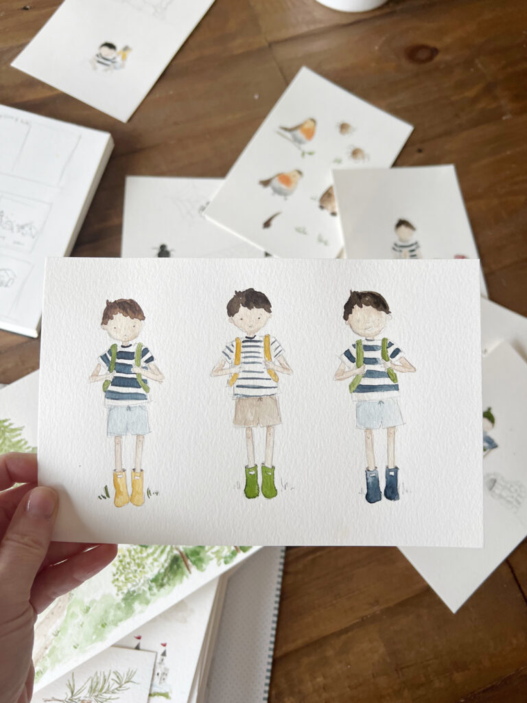
Even though our main character’s name is Brady boy (named after our second son), Build is wholly inspired by my husband and all three boys and you’ll find little nods to each of them throughout the book, both in words and pictures. It felt right to give him Ryan’s hair and skin coloring, and I dressed him in things my boys wore when they were little – a striped t-shirt (that coordinates so adorably with Audrey girl’s dress in Twirl!), easy shorts, yellow rain boots. Even his little backpack is inspired by my oldest son’s!
The animal friends were fun to dream up. I used a ton of reference photos to figure out what each animal looks like and how they move so I could try to make them look natural.
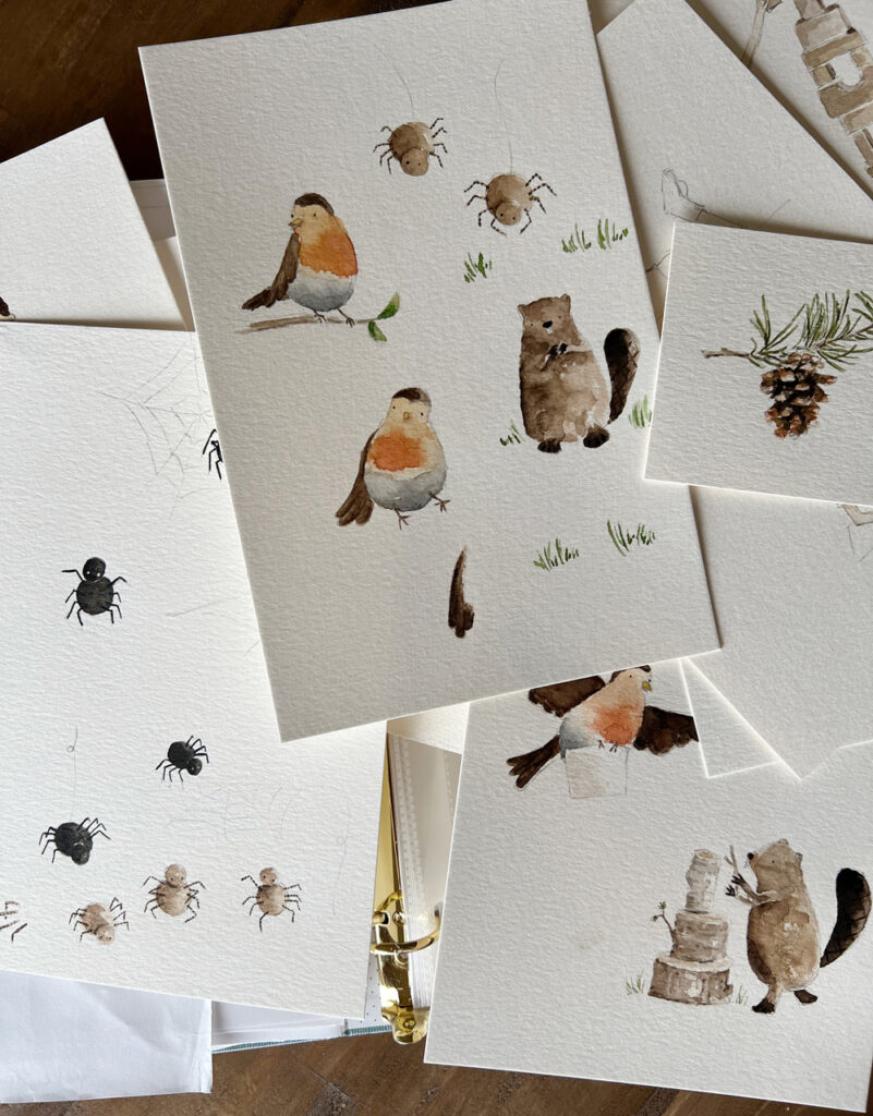
Itsy Bitsy Spider took the longest to get just right (even though she is so simple!). How do you make a spider look cute and not creepy?! Wide-set tiny dots for eyes, pink cheeks, striped legs, and a friendly brown color seemed to do the trick. Her spider web was drawn with pencil and I love the detail of her web in the pictures.
One of the trickiest parts about illustrating characters is keeping them consistent from page to page and from all different angles. One of the little tricks I learned is that keeping the clothes and accessories the same throughout the story helps a child identify the character and the imperfections in proportion, eye placement, etc. are much less noticeable!
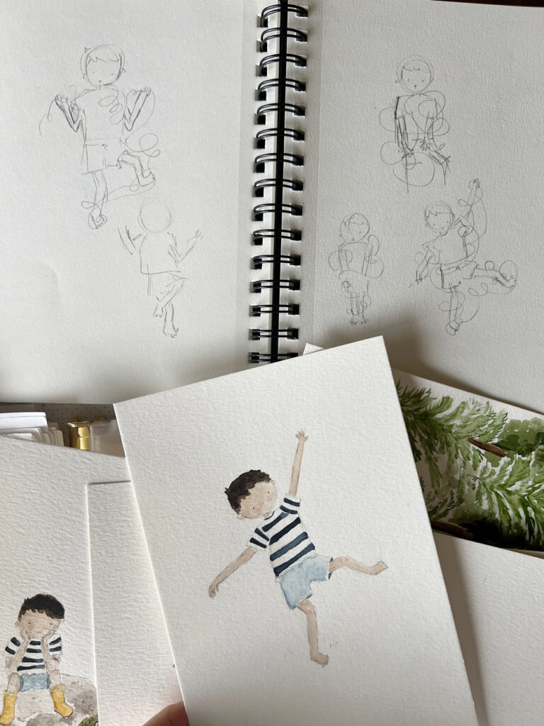
When it came to movement, once again, I followed the same strategy as with illustrating twirl and used reference photos. What does a little boy look like sitting crosslegged building legos? What about sneezing? Or tangled up in string? Sometimes I moved my own body into a pose to figure out what a body does and that was helpful too 🙂
all the extras
You know how much I love paying attention to little details and this book is no different. You’ll find cute end sheets (I love cute end sheets!), a sweet bible verse, a dedication, and an about-the-author page. My publishing team was so creative with the suggestion for the about the author page and I hope it brings one last smile before you close the book. These special pages were so fun to create!
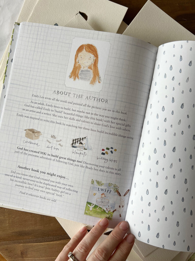
The cover came toward the end of the design process and you can read all about that here.
Just like with Twirl, I was able to incorporate hand lettering into the pages of Build. The sketchy pencil, rubber-stamp-inspired letters make this book feel even more playful, personal, and full of imperfect charm.
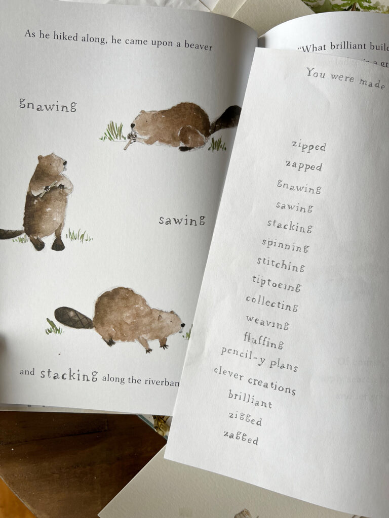
Writing and illustrating Build was a dream come true for me and such an incredible experience. I hope this was a fun peek into the illustrating process. If you have any questions, please leave a comment and I’d love to answer!

Thanks for sharing your process! One of my favorite children’s illustrator and author is Tommie DePaola. Loved reading his books to my girls when they were little. Can’t wait to order yours to read to my new to be grandbaby
Excited about landscape paintings from you!
Love love love your illustrations and all that you do! I purchased both your books for my grandchildren…can’t wait to see “Build” in person!!!
I have bought many of your products and look forward to painting in your spiral books!!!
Keep up all the great work!
Enjoying your blog and all of your suggestions!
This was so insightful! I am very visual and the way you displayed your ideas and illustrations on the walls, sketched out before you started…that’s helpful! Thanks for sharing! It was so interesting to get behind the scenes. Happy Valentine’s Day!
I am a 73 year old former kindergarten teacher and current grandmother of ten precious kids. I grew up on a farm and now spend many days at our cabin on five wooded acres on a lake and in my yard and garden at home. I love watching children create, build, explore and pretend. I love being outdoors.
I am not a social media user except for keeping in touch with friends and family. So I am not sure how I stumbled upon your site. But I see it as a true gift, an unexpected blessing. It brings a smile to face and joy to my heart every time I encounter you and your work. Thank you for sharing your talents.
It’s beautiful, Emily!
Emily, I recently bought a copy of Twirl with 3 workbooks and sticker sets for my 3 granddaughters 8, 5 and 3 years old. They loved everything! My daughter read the story then we looked through the workbook so they are very excited to get started. Thank you for your precious stories. Many blessings to you!
Thank you so much Delsie!
I love your style! I am a newly watercolor artist. And I love the simplicity, yet beautiful detail that you have. Thank you for simplifying such a beautiful form of art for me ….a beginner.
Absolutely beautiful, Emily. I have followed you for many years — and enjoyed all your home renovations.
Thanks for sharing all the behind-the-scenes of this book. I especially liked seeing your work station. You have inspired me to maybe take up watercolor. I am a graphic artist and on my computer all day long but wish to do something a bit more artsy. You have incredible talent, thank you for this!!
Thank you for sharing your process and all the pictures/paintings. I absolutely love them!
Oh, thank you for sharing! I started following you when you had a goal to paint something every day – not knowing what you would do with them all. I love your style of art and watercolors.
This book sounds adorable, and I love you did both a boy and girl one. Children today need more beauty and creativity. ❤️
Isn’t it crazy how that year of painting turned into something so much more?! I’m grateful.
Beautiful! Thank you for sharing your process. Your art work/illustrations and book(s) are truly unique, inspiring, and fun!
Thank you so much for taking the time to share! I loved reading and seeing your process!
Thanks so much for such a a detailed review! I’ve recently landed my first book illustration job, so this was perfect timing. I love how you put all the pages up on the wall, such a great idea!
Question: are you self publishing? If so, with whom?
I publish traditionally with Harvest House Publishers and have loved working with them!
Lovely to see, thank you for sharing
I loved being able to look into your process of creating your latest children’s book! Your artistic ability just continues to grow and you expand your delightful creative painting and storytelling. I can’t wait to hold a book in my hands!
That’s very kind of you to say. Thank you!
I loved this. Thank you for sharing your process!!!! Your books are so sweet.
Thank you Sandee!
Your illustrations are so charming! I love pouring over illustrated children’s books, too. Thank goodness I have eight grandchildren and have an excuse to buy lots of children’s books. Thanks for sharing your work. It’s really lovely.
Thank you so much! I hope your little grandbabies love your book collection.
I love these illustrations. Thank you for sharing your process. I’m a new watercolor artist and I’m working on illustration a story my daughter created with one of her sons.
I’m wondering what printer you use for your projects. Also, does Illustrator take long to learn?
Thank you again for sharing.
I have a canon photo printer at home that I print things on – I don’t use this for any of our products, but it works great for at-home proofs! Illustrator is a little complicated at first, but take a class and you’ll do great!
Congratulations! 🎉 And thank you for gracing us with another treasure. I gifted both my nieces with Twirl for Christmas. I love the simplicity of your art… and the airiness of your work creates a simple beauty that I’m always drawn to. And I know littles will love it too. Thank you for sharing the process, it’s so intriguing.
How long was the process from beginning to end?
Thank you so much for sharing Twirl with your nieces! The whole process from start to finish for the illustrations was about 6 weeks.
Emily!!! This was such fun to see and enjoy your narration! I cannot wait for the book to be ready; I have ordered 4 already from Christian Books and they have Twirl as well. Cannot tell you how many of Twirl I have given to little girls and now excited for little boys turn. Blessings and keep writing Children’s books.
Irene Talaasen
Woodland Park Colorado
Thank you SO much! Your support really means so much!
It is beautiful, Emily. Thank you for sharing your process. I am curious what your “very high DPI” was exactly — 300, 600, 1200? I would love to create something like this one day, too. 🙂
I scan at 600 dpi. Seems to work really well!
What a wonderful addition to the beauty needed in children’s illustrations and books. Your love of life and joy shine through. Thank you for sharing your process.
Do you submit your books for contests? You probably already know about the society of children’s book writers and illustrators.
Thank you so much! It’s a joy to get to create these.
I enjoyed reading about your process of creating and illustrating Build! I too, have always loved the details in illustrations from my own childhood books and my daughters’ books. Your artwork is fantastic and thoughtful, and I will be purchasing your books in the near future (I just found out I’m going to be a grandma!!)
So exciting! Congratulations!
Hi I’ve been enjoying your watercolor books for a while – I bought your book for my niece and she loves it – I am working on my second book and I think I’m going to try to do it in all water color – my first book I self published because I couldn’t find a literary agent – my book is called the horse who wore glasses . I did all my illustrations with colored pencils . Since then I purchased a tablet and being 61 it’s very hard to navigate the procreate app . Here I am thinking it would be easier to illustrate . You have inspired me . Thank you Lisa oddo
Just ordered Build for my small grandsons and I am so excited to read it to them! Thank you for the pre-order gift offer, what a lovely thought 🩵